Golden Gate Squircle Jail
With last year’s release of MacOS 26 (Tahoe), Apple made a mess of app icons. In the first betas of MacOS 27 (Golden Gate), however, there are signs of a turnaround. We’re urging Apple to continue making improvements, by restoring the ability for MacOS app icons to have distinct shapes.
[…]
After decades of beautiful, memorable Mac icons in varying shapes, Tahoe flattened personality to obtain bland uniformity. The platform is worse for it.
Past icons weren’t just more expressive. They were also more usable. Having distinct shapes provided a useful way to tell icons apart. Tahoe eliminates that cue by forcing everything into the same squircle, leaving color as the primary way to tell icons apart at a glance.
Kafasis makes the important point that uniform shapes make it more difficult for users, especially those with vision issues including color deficiency, to differentiate between icons.
Squircle Jail is the worst design-related thing Apple has ever done to Mac developers, and probably the worst icon-related thing it has ever done, period. Incredibly developer-hostile.
If squircled icons are actually better, then let that design win in the market. That’s how we transitioned from the classic Mac OS icon style to the more photorealistic Mac OS X icon style. Developers adopted it because they wanted to, and because users desired it.
The squircles, I will point out, are not in and of themselves the problem. The problem would be the same with any mandated shape, like, e.g., VisionOS’s circles.
[…]
I can’t think of any other design crime Apple has ever foisted on Mac developers that I’d argue (with Siracusa) was worse.
[…]
It’s like Apple decided every single one of its own apps must wear a stupid-looking hat, and they put those stupid-looking hats on third-party apps too, whether the developers of those apps want them or not. Scratch that. Not hats but helmets.
[…]
Just the mere silhouette of the old Keynote icon is more recognizable, and thus more iconic, than any icon on any platform from Apple today.
The traffic sign analogy hits me personally, because the StopTheMadness icon used to be shaped like a stop sign, but I was practically forced into making it a generic road sign.
I get why Apple did it, but I think it’s completely wrong for the Mac.
On his blog, Jim Nielsen writes how Apple filed away so much expression by forcing rigid icon bureaucracy in macOS. Nielsen focuses mostly on distinctiveness; previously, you could make the icon unique by its general shape or the shape of its contents, but one of these two levers has now been taken away[…]
[…]
However, one also can’t help but notice how ugly and amateurish the Creator Studio icons are, so it all feels absolutely like a net negative – the new system took something away and the proposed replacement feels low quality[…]
I, too, find the squircles aesthetically offensive and utterly pointless.
[…]
The part that genuinely breaks my brain, though, is that I now find icons on Linux more distinctive than on macOS, which would be impossible for my ten-year-ago self to believe. The platform that built its reputation on craft and visual identity has spent a year sanding it off, while the one everyone used to mock for its inconsistency is where individuality survives.
The subliminal, Orwellian message of the squircle jail is that all software is subservient to Apple, merely accessories to Apple devices, interchangeable cogs in the machine.
Had to grab the rest of the icons from #MacOSX Leopard. Gosh, they’re so, so pretty. So finely crafted. Gorgeous. Love it.
I agree, but Apple’s 50th anniversary has gotten me thinking a lot lately about the early days of the Mac, so it’s only natural that my mind shifted to the highly constrained icons Mac applications had back then.
[…]
Many of the complaints about squircle jail are about the loss of icon elements that “stick out” from the rest of the design. As you can see, this idea was there from the very start; the hands stick out from the tilted rectangles.
I never loved the hand on these icons. It felt too uniform. It functioned like a “this is an application” badge, but such a badge never felt necessary to me.
[…]
I think it’s less that Apple gave up on them and more that it came into focus that the “hand holding a pen over a diamond-shaped document” convention was intended for document-based apps. It signified “This is a creative tool that you use to create documents”. Apps that weren’t about creating document files — like Disk First Aid and Font/DA Mover — got different icons. Font/DA Mover’s truck icon in System 2 signified that you use this tool to move things. Disk First Aid’s ambulance was an obvious metaphor for repairing something unwell.
[…]
But the main thing about the “hand holding pen over diamond” convention was that it was only ever a convention.
(a) I don’t think this is a good mandate for iOS either;
(b) it was always so for iOS, though, so it’s not like Apple has ever taken away rich creative icon shapes on the platform;
(c) MacOS is a far richer and more precise environment than iOS.
[…]
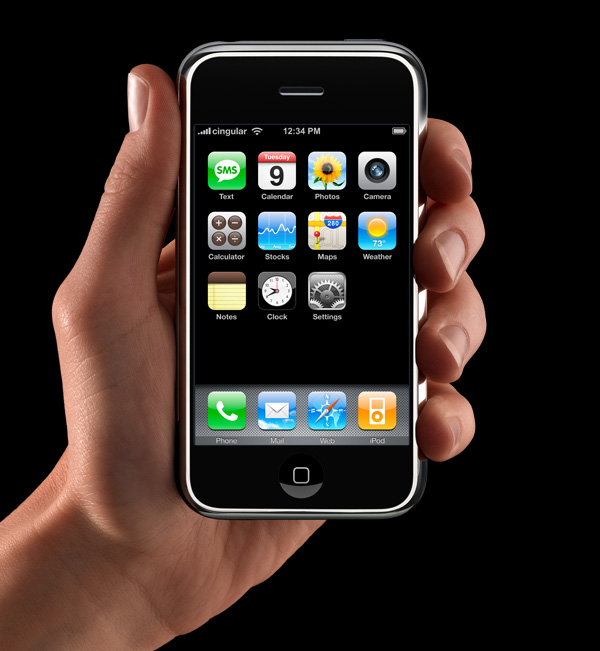
App icons on the iOS home screen are effectively simple buttons. I think it’s rather obvious that’s why they have had that squircle/roundsquare shape ever since the iPhone was announced in January 2007 (source). They’re one-tap launchers. App icons in MacOS are not mere buttons. You can drag them, move them, and drop things on them. You click them to select, and double-click to launch. They are richer objects that deserve a richer visual vocabulary. iOS is a world meant for fat-tipped Magic Markers and blunt safety scissors. MacOS is a world meant to support fine-tipped drafting pens and precision razor-sharp X-ACTO knives.
While developers have submitted full-bleed square images for iOS app icons since 2008, for these new squircle icons in macOS 11, Apple provided a template to compose app icons in an image editing tool like Photoshop, with full control over the canvas beyond the suggested—but not required—squircle. This template made it easy-ish for designers to compose macOS app icons that were identical to or synonymous with an iOS app icon, while leaving the door open to continue using arbitrarily-shaped app icons on macOS.
[…]
The second type of Squircle Jail is more controversial, because these app icons were specifically drawn with the intention of fitting in. Overriding that intention feels like punishment for having done the right thing. App icons in a style that was recently encouraged by the system are now scaled down and put inside the squircle as if it were a container. Every icon that was utilizing the previous squircle shape suddenly looks much worse than before.
[…]
Instead of taking care to design and develop solutions specifically for Mac and iPhone, newer and bigger companies that don’t only make apps often ship apps with logo icons, rather than app icons. We’ve all seen it.
[…]
I would love if Apple provided a way for designers to poke outside that squircle boundary. Some of my favorite app icons did that. But also some of my least-favorite app icons ignored this shape entirely, when it was used for every system icon in the last five years. Whenever those apps showed up in my Dock, it was like a stain on my shirt I couldn’t get out.
Ultimately this is what I object to with the squircle mandate. It favors the bottom of the heap by restricting the top. It makes bad icons mediocre but pushes great icons toward mediocrity too. That’s not The Macintosh Way.
Mantia touches on all the pragmatic reasons to unify the shape of icons in an operating system, all of which I have considered, and then drops the above paragraphs — and things started to make more sense to me. This is a different way to think about it. This is not a situation where a cleaner looks like a zesty beverage with toxic consequences. The shared general function of these icons does help communicate something and makes them less ambiguous in that sense.
But a broad category of functionality is only part of the story of an icon and — with respect to Mantia’s long and illustrious history of work in this area, and that of co-Parakeeter Luka Grafera — taking away a difference of shape also limits what an icon can communicate. It may not be a cleaning product that looks and is packaged like juice, but imagine if every consumable liquid was in identical bottles with only a different label.
Louie’s squircle jail post just underscores that the squircle jail benefits 99% of apps, and is better for the platform overall. There is only ever a handful of apps that make great Mac app icons, and a withering number of ‘great Mac app icon designers’ — you can probably only name one or two left in the scene.
Mantia talks as if it were more important for apps to “belong to the Dock” than to allow Dock users to quickly select the right app in the list. That’s choosing form over functionality.
“The shape of apps is a squircle.” But Mac users already knew those were apps in the Dock!
See also: Accidental Tech Podcast.
If you’re lucky enough to distribute an app outside the Mac App Store, you can break free of squircle jail using NSDockTilePlugIn. It’s not strictly the intended use-case of that API. And it’s not allowed in the Mac App Store, either. But it can solve the problem.
If you recognize these icons, it’s probably time to schedule your routine back exam.
Previously:
- Clear and Tinted Icons Are a Hard Pass
- Liquid Glass 27 Icons
- Apple Creator Studio Icons
- Tahoe’s Terrible Icons
- One Size Does Not Fit All
- macOS Tahoe 26 Developer Beta 4
- macOS Tahoe’s New Theming System
- macOS Tahoe 26 Announced
- The macOS App Icon Book
Update (2026-07-17): Louie Mantia:
But my perspective right now is to be very pragmatic. The decision to mask all icons with squircles is a long-time coming. It was perhaps the most predictable thing to happen in Apple’s history. For 20 years, it’s been leading up to this.
I want to make nice things for macOS, whatever macOS is. And this is what it is.
Some of my favorite icons over the years have had interesting shapes, like the truck for Transmit, the vise for Compressor, or the cute bird for Twitteriffic.
[…]
But I also recall clicking some icons and not being able to select them. Why? Because I was inaccurate in my click and instead my cursor landed in the empty space just outside the shape.
[…]
If I recall correctly, developers could use a different mask for the click target to help users out. But I don’t think many did all the time, including Apple, which you can obviously see in the video above.
I don’t want to step on toes regarding your new [StopTheMadness] icon which has great color— but I don’t understand why you elected to abandon the octagon as the outer shape. That’s a choice. You are not forced to abandon it. Why not do something like this?
I like this.
Losing some of the artistry in an icon makes it more difficult to distinguish between legitimate and well-crafted Mac apps, and everything else. It is not a perfect proxy, to be sure, and there are some very nice squircle icons. But it is nevertheless a unfortunate change that makes apps of varying levels of quality look more similar.
27 Comments RSS · Twitter · Mastodon
Mantia:
> The “flat design” appearance of iOS 7 did not occur to be trendy, to stroke an executive’s ego, or even to make things better for users. This was for the benefit of newer third-party developers and big companies who were unable or unwilling to execute at the level required of Apple’s previous platform style.
🙄🙄🙄🙄🙄🙄🙄🙄🙄🙄
This is the silliest post facto justification of another one of the worst design atrocities in the history of Apple's UI. iOS 7 was just an excuse for a company to justify a yearly update and unnecessary work that added nothing to the platform. iOS 7 was cartoonish, and the results still look awful to this day. Safari's app icon is absolutely atrocious. The weather app icon looks flat and ugly. Everything from before iOS 7 and the accompanying macOS redesign looks objectively better. There was no one at that time saying that flatter icons made it easier on less-capable icon designers, and it's a terrible reason to cater to the lowest common denominator anyway. Every one of Mantia's examples of squircle jail in his post look **better** pre-squircle jail. This is a great example of a designer justifying ultra-consistency (and, perhaps, his own services) at the expense of everything else.
@Simone I don’t know what Apple’s real thinking was, but I definitely remember a lot of developers talking about how flat design made things easier for them. With Mantia being an expert at the more difficult style, his post seems like an admission against interest rather than justifying his own services.
I have a feeling that the "squircle jail" is a technical limitation they have in IconServices with regards to rendering their ugly Icon Composer monstrosities in "clear" and "tinted" mess. Instead of sorting that technical mess, they came up with a pretty rudimentary algorithm that determines if an icon is a squircle or not, if so, cuts opacity from the edges (shadows) and replaces them with the system standard. I guess someone just shrugged and said "I don't care", and here we are.
If you paste an image into a Get Info window of an app, the resulting icon becomes a mess under clear and tinted, something that doesn't happen even when not using Icon Composer.
"There is only ever a handful of apps that make great Mac app icons […]." - STS
It's not because that he's OK shipping mediocre icons for his applications that everyone else should be prevented from trying to ship gorgeous icons.
That being said I don't understand why people are trying to find scientific explanations to explain why the icons on macOS Tahoe suck. Why not just write the obvious: during his entire tenure, Alan Dye has shown no signs of having good taste when it comes to icons. The issues with macOS icons did not start with Tahoe, they started in 2013 when he ruined most OS X system application icons.
I find it so funny when these Apple ecosystem "thought leaders" regurgitate talking points from years ago, and start a whole cascade of conversation that was already had, including in the comments on this website. Like what prompted kicking this dead horse all the sudden, lol?
@Simone - Couldn't have said it better.
@someone - They really need to go back to their old process of designing the icons in Cinema4D. The 10.10 release was garbage, and picking Helvetica Neue for the system font, just go and look at any old screenshots to see how ugly the menubar looked before SF came out/got put into place. Fan-made Linux-shell grade design choices. And we've had to suffer with them FOR YEARS.
Mantia conflates two things that are not meant to be the same: the icon itself, and the BUTTON (squircle) that it *might* be placed on. When in the phone’s springboard or other UIs, it is an app icon that is tappable and looks like a button, which *would* make a squircle somewhat useful. App icons have other contexts though (frankly, even on iOS), like sidebars, where the mandated shape reduces the room for important details and implies a function (tappable button) that does NOT work.
This is a good thread to pile on complaints. Agree with all of it. I want to believe Apple knows they made a huge mistake and are already planning to fix it. But it’s hard to say.
It seems the trend in software in the upcoming year is to undo all the damage that’s been done over the last decade, so it’s not entirely hopeless.
First up, I want to bring attention to this recent app called SquircleNoMore from Tweaking4All, since no one else has. It's a drag-and-drop utility that lets users remove the gray squircle jail from affected apps by simply dragging the app onto the utility window. It basically automates the process as described on heise.de (9to5Mac's guide is really more for custom icons). Simon B. Støvring's blog also has additional info for updating the icon during runtime.
Next, I saw an interesting point Roger Wong brought up about click targets on icons (specifically 10.4 Tiger):
First up is Apple’s Automator icon. I tried to click just outside the robot shape and it didn’t register, despite the fact that when I clicked on the robot’s body, the gray square highlight includes that empty space. Same with the icon for Chess. Interestingly, when clicking inside the counter for the QuickTime icon, it worked. It also worked when I clicked just underneath the magnifying glass in the Sherlock icon.
I don't necessarily agree with his conclusions, but now I'm curious to know (based on the 10.4 Tiger video he posted) when this alpha transparency click-through (a.k.a. the "hit mask") was removed? I thought it must have been before Tahoe, but judging from here (also here) it was still present in Sequoia at least for desktop (but not dock apparently).
@Ben I was thinking the same thing. Where was a fraction of this energy last year when so many shill reviewers gave Liquid Ass a pass, or the last 7 years of SwiftUI and Catalyst Apps crapping up the Mac? The Squircle Jail sucks, yes, but it's a footnote in the overall garbage UI/UX direction.
An icon is part of the presentation / branding, but you look at an icon for a fraction of the time you use the App. This rallying call has the same energy as returning a dented box to Customer Service. You're not mad the product was trash, but you're hella mad about the condition of the box? What are they doing?
I don't particularly like Helvetica Neue, but it offers multiple weights and Italic faces. Helvetica has fewer weights and oddball "Oblique". Old Lucida Grande lacks Italics. HN ugly for a system font, passing for a user font.
1. Flat design was a desperate attempt to be trendy. People were mocking the skeumorphic design of iOS left righ and center and Apple ruched it out the door because they just can't stand it when people laugh at them
2. I personally find it weird how indie-devs fawn over the beige middle of the road design of app interfaces, yet throw a tantrum when they're not allowed to do expressive and fun icons for the same apps. Use that creativity in your apps ffs.
I was on board with Mantia's blog post until he started trying to justify all the Mac's icons being the same shape. It's one thing on iOS, where they've always been uniform (arguably with the rationale that they needed to look like tappable buttons, too). But on the Mac, how can anyone possibly argue that's *not* a usability regression?
> I want to make nice things for macOS, whatever macOS is. And this is what it is.
Like a good little doggie, do what you’re told.
There already was iOS style icons on Mac before the enforced squircle jail (Catalyst apps etc.)
Unlike Gruber I get it on iOS. The screen is small and you touch icons. They should have the same shape. On Mac things are different. You see a lot more detail on a bigger screen.
Also maybe it’s just me but putting the StopTheMadness icon in front of a blue rounded rectangle doesn’t look very good. All these designers are overconfident and love the smell of their own shit.
That said, I wouldn’t be super excited if they reverted. Like I can’t be getting my icons redone every fucking year.
> 1. Flat design was a desperate attempt to be trendy. People were mocking the skeumorphic design of iOS left righ and center and Apple ruched it out the door because they just can't stand it when people laugh at them
And yet, iOS 27 horrible design with the worst update % in Apple history is mocked constantly, Siri was for a decade, and ppl complain since many years about obvious bugs and defects in both iOS and macOS. Has Apple rushed to fix anything? No. So your narrative is proven wrong by reality.
What amused me a lot with the flat trend up to this days is that it followed the same history as architecture giving up ornaments and style. It was so easy to foresee the outcome as we have so many previous examples.
All apps look the same, it takes far less work to do UI and icon design, yet designers charges you as much and poor skilled designers can now pretend to be as good and charge as much. Also they didn't take the saved time to make better usability nor anything. Just pocketed the free time and charges the same and lost the skills for those who had it to begin with. A complete disaster and lost of craftsmanship alongside Apple itself.
IMHO i would never pay for a designer today, i can easily do whatever they do. But I couldn't do their job during the golden era of iOS design. Their loss. Now they are really at the level of the "my nephew could do it in PS why do i pay you so much" meme.
@Damien "Good design has no need of Clean Lines. They are a form of decorative Ornament".
The lack of ornament always becomes decorative and fetishised, because people are, by nature decorators.
Eliminating design from app making has been the goal for a long time. The project is to make systems that are inherently all the design necessary, by virtue of their function. But developers' icons, that's *their branding* and you can bet app developers get pissy about Apple touching that.
@ObjC4Life It's not just you.
Also, you can't look at the giant mockup. Users don't see the icon that large. You have to look at the tiny version at the bottom, like it would be in a Dock full of other apps.
Mantia is full of himself and full of crap. He says "I don’t want to step on toes regarding your new icon" and then boosts his own reply to his 4000 followers. WTF? It appears that he did in fact want to step on toes.
He talks condescending as if he had some genius designer idea to put the stop sign inside the squircle that I had never even considered, which of course is impossible not to have considered: the whole debate is how the operating system itself automatically puts your icon inside the squircle if you don't do anything.
I ended up blocking him. We had a discussion, which I deleted out of frustration, because he continued to be equally condescending, willfully misinterpreting everything I said, not listening to me, not trying to understand or help, just trying to prove his own point.
The crazy thing is that in a million years I would never have independently chosen a squircle for my app icon except for the Apple squircle mandate. You can like or dislike the app icon, tastes differ, agree or disagree with my choices, but don't tell me that Apple isn't shoving this down everyone's throats.
> Losing some of the artistry in an icon makes it more difficult to distinguish between legitimate and well-crafted Mac apps, and everything else.
I don't like this type of thinking. It's great to want great icons but buying a high quality app icon doesn't magically make your app more functional or work better--it just means you have money to pay an artist.
>> Why not do something like this?
> I like this.
Seriously?
As a reminder, in the Think Different campaing, it's "The round pegs in the square holes.", not "The octogon in the squircle jail.".
@someone I prefer the original icon, but compared with the official squircle icon I like that it features the octagon more.
Apple 2026: "Think different within our enforced uniform design, app stores, locked down apis and walled garden"
Trademark authorities should strip all protection from the Apple logo, unless displayed within a squircle .
Pffft! Far too much religiosity on here. I'm with @billyok, macOS slouches ever toward mediocrity and everyone knows it. Maybe I'm not the most qualified to have a take, but it does seem pretty clear that both sides have legitimate stakes in this and Apple should just make the squircle a default to benefit the 99%, whilst giving the artisans the freedoms they crave to express themselves.
@Michael The link to Jeff's post is now defunct, as he says.
Perhaps Dye spent some short amount of time wondering why developers and users alike, with different depths, complain about something so minor as recognizing an icon before tapping or clicking it. When multiple options to find an app are offered and the average number of apps installed on a user’s device went way beyond what was common decades ago. He had a point.
From an industrial point of view it makes absolutely sense to have the four major Apple OSs sharing as much as possible. For a consumer point of view instead I sense a lack of differentiation. People like inconsistencies for the sense of realism and truthfulness.
Something hardly excusable though is the very poor execution. Of something equivalent to changing keycaps colors.
>I don’t think this is a good mandate for iOS either
Same.
It always felt to me like Steve Jobs thought Mac OS Classic's At Ease should not only become the _default_ launcher on the iPhone, but also the _only_ launcher; app icons should look like buttons, always. This had some unfortunate consequences. But also, even if we buy that this is a good choice for a phone, it isn't how macOS works, even today (with the exception of unlaunched apps in the Dock).
---
>The “flat design” appearance of iOS 7 did not occur to be trendy
Leaving aside whether iOS 7 was intended to be flat (seems to me Ive's vision was about having various sheets of glass on top of each other, but few third parties cared), I absolutely think Apple rode a design trend of the time, established by Microsoft (with Zune, Windows Phone 7, etc.), then adopted by others.
> This was for the benefit of newer third-party developers and big companies who were unable or unwilling to execute at the level required of Apple’s previous platform style.
Not entirely wrong, but I don't buy Mantia's assertion that this was the _chief_ reason for the redesign. The chief reasons were 1) let's mix it up with a new design, 2) this is a trend anyway, and 3) we have some management reshuffling going on in the design department.
I guess there are always different aspects that play into these decisions, but at the time, there was no question that "flat" ("authentically digital") was the trend, and Apple wanted to look trendy and modern. If that's not the only reason for the redesign, then it is definitely the primary one.
Anyone who claims something else was the primary motivation is engaging in revisionist history.
@ObjC4Life
> Like a good little doggie, do what you’re told.
And that's how he debates too. I tried to debate with him on Mastodon, but it came down to him saying "Shut up, I'm the fancy designer with 20 years of experience, and you are a lowly user who doesn't know what they are talking about", despite me using Macs for 35 years and the last 5 or so having so much insane frustrations at finding icons in the Dock because they are all the same shape!
@Jeff Johnson I guess I should've kept reading.
> I ended up blocking him. We had a discussion, which I deleted out of frustration, because he continued to be equally condescending, willfully misinterpreting everything I said, not listening to me, not trying to understand or help, just trying to prove his own point.
That's exactly my experience I had with him, not surprised he's like that with others too. He's a big fancy designer with 20 years of experience, and he knows what more then you, don't you know!!