Golden Gate Squircle Jail
With last year’s release of MacOS 26 (Tahoe), Apple made a mess of app icons. In the first betas of MacOS 27 (Golden Gate), however, there are signs of a turnaround. We’re urging Apple to continue making improvements, by restoring the ability for MacOS app icons to have distinct shapes.
[…]
After decades of beautiful, memorable Mac icons in varying shapes, Tahoe flattened personality to obtain bland uniformity. The platform is worse for it.
Past icons weren’t just more expressive. They were also more usable. Having distinct shapes provided a useful way to tell icons apart. Tahoe eliminates that cue by forcing everything into the same squircle, leaving color as the primary way to tell icons apart at a glance.
Kafasis makes the important point that uniform shapes make it more difficult for users, especially those with vision issues including color deficiency, to differentiate between icons.
Squircle Jail is the worst design-related thing Apple has ever done to Mac developers, and probably the worst icon-related thing it has ever done, period. Incredibly developer-hostile.
If squircled icons are actually better, then let that design win in the market. That’s how we transitioned from the classic Mac OS icon style to the more photorealistic Mac OS X icon style. Developers adopted it because they wanted to, and because users desired it.
The squircles, I will point out, are not in and of themselves the problem. The problem would be the same with any mandated shape, like, e.g., VisionOS’s circles.
[…]
I can’t think of any other design crime Apple has ever foisted on Mac developers that I’d argue (with Siracusa) was worse.
[…]
It’s like Apple decided every single one of its own apps must wear a stupid-looking hat, and they put those stupid-looking hats on third-party apps too, whether the developers of those apps want them or not. Scratch that. Not hats but helmets.
[…]
Just the mere silhouette of the old Keynote icon is more recognizable, and thus more iconic, than any icon on any platform from Apple today.
The traffic sign analogy hits me personally, because the StopTheMadness icon used to be shaped like a stop sign, but I was practically forced into making it a generic road sign.
I get why Apple did it, but I think it’s completely wrong for the Mac.
On his blog, Jim Nielsen writes how Apple filed away so much expression by forcing rigid icon bureaucracy in macOS. Nielsen focuses mostly on distinctiveness; previously, you could make the icon unique by its general shape or the shape of its contents, but one of these two levers has now been taken away[…]
[…]
However, one also can’t help but notice how ugly and amateurish the Creator Studio icons are, so it all feels absolutely like a net negative – the new system took something away and the proposed replacement feels low quality[…]
I, too, find the squircles aesthetically offensive and utterly pointless.
[…]
The part that genuinely breaks my brain, though, is that I now find icons on Linux more distinctive than on macOS, which would be impossible for my ten-year-ago self to believe. The platform that built its reputation on craft and visual identity has spent a year sanding it off, while the one everyone used to mock for its inconsistency is where individuality survives.
The subliminal, Orwellian message of the squircle jail is that all software is subservient to Apple, merely accessories to Apple devices, interchangeable cogs in the machine.
Had to grab the rest of the icons from #MacOSX Leopard. Gosh, they’re so, so pretty. So finely crafted. Gorgeous. Love it.
I agree, but Apple’s 50th anniversary has gotten me thinking a lot lately about the early days of the Mac, so it’s only natural that my mind shifted to the highly constrained icons Mac applications had back then.
[…]
Many of the complaints about squircle jail are about the loss of icon elements that “stick out” from the rest of the design. As you can see, this idea was there from the very start; the hands stick out from the tilted rectangles.
I never loved the hand on these icons. It felt too uniform. It functioned like a “this is an application” badge, but such a badge never felt necessary to me.
[…]
I think it’s less that Apple gave up on them and more that it came into focus that the “hand holding a pen over a diamond-shaped document” convention was intended for document-based apps. It signified “This is a creative tool that you use to create documents”. Apps that weren’t about creating document files — like Disk First Aid and Font/DA Mover — got different icons. Font/DA Mover’s truck icon in System 2 signified that you use this tool to move things. Disk First Aid’s ambulance was an obvious metaphor for repairing something unwell.
[…]
But the main thing about the “hand holding pen over diamond” convention was that it was only ever a convention.
(a) I don’t think this is a good mandate for iOS either;
(b) it was always so for iOS, though, so it’s not like Apple has ever taken away rich creative icon shapes on the platform;
(c) MacOS is a far richer and more precise environment than iOS.
[…]
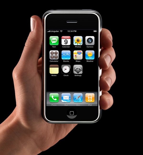
App icons on the iOS home screen are effectively simple buttons. I think it’s rather obvious that’s why they have had that squircle/roundsquare shape ever since the iPhone was announced in January 2007 (source). They’re one-tap launchers. App icons in MacOS are not mere buttons. You can drag them, move them, and drop things on them. You click them to select, and double-click to launch. They are richer objects that deserve a richer visual vocabulary. iOS is a world meant for fat-tipped Magic Markers and blunt safety scissors. MacOS is a world meant to support fine-tipped drafting pens and precision razor-sharp X-ACTO knives.
While developers have submitted full-bleed square images for iOS app icons since 2008, for these new squircle icons in macOS 11, Apple provided a template to compose app icons in an image editing tool like Photoshop, with full control over the canvas beyond the suggested—but not required—squircle. This template made it easy-ish for designers to compose macOS app icons that were identical to or synonymous with an iOS app icon, while leaving the door open to continue using arbitrarily-shaped app icons on macOS.
[…]
The second type of Squircle Jail is more controversial, because these app icons were specifically drawn with the intention of fitting in. Overriding that intention feels like punishment for having done the right thing. App icons in a style that was recently encouraged by the system are now scaled down and put inside the squircle as if it were a container. Every icon that was utilizing the previous squircle shape suddenly looks much worse than before.
[…]
Instead of taking care to design and develop solutions specifically for Mac and iPhone, newer and bigger companies that don’t only make apps often ship apps with logo icons, rather than app icons. We’ve all seen it.
[…]
I would love if Apple provided a way for designers to poke outside that squircle boundary. Some of my favorite app icons did that. But also some of my least-favorite app icons ignored this shape entirely, when it was used for every system icon in the last five years. Whenever those apps showed up in my Dock, it was like a stain on my shirt I couldn’t get out.
Ultimately this is what I object to with the squircle mandate. It favors the bottom of the heap by restricting the top. It makes bad icons mediocre but pushes great icons toward mediocrity too. That’s not The Macintosh Way.
Mantia touches on all the pragmatic reasons to unify the shape of icons in an operating system, all of which I have considered, and then drops the above paragraphs — and things started to make more sense to me. This is a different way to think about it. This is not a situation where a cleaner looks like a zesty beverage with toxic consequences. The shared general function of these icons does help communicate something and makes them less ambiguous in that sense.
But a broad category of functionality is only part of the story of an icon and — with respect to Mantia’s long and illustrious history of work in this area, and that of co-Parakeeter Luka Grafera — taking away a difference of shape also limits what an icon can communicate. It may not be a cleaning product that looks and is packaged like juice, but imagine if every consumable liquid was in identical bottles with only a different label.
Louie’s squircle jail post just underscores that the squircle jail benefits 99% of apps, and is better for the platform overall. There is only ever a handful of apps that make great Mac app icons, and a withering number of ‘great Mac app icon designers’ — you can probably only name one or two left in the scene.
Mantia talks as if it were more important for apps to “belong to the Dock” than to allow Dock users to quickly select the right app in the list. That’s choosing form over functionality.
“The shape of apps is a squircle.” But Mac users already knew those were apps in the Dock!
See also: Accidental Tech Podcast.
If you’re lucky enough to distribute an app outside the Mac App Store, you can break free of squircle jail using NSDockTilePlugIn. It’s not strictly the intended use-case of that API. And it’s not allowed in the Mac App Store, either. But it can solve the problem.
If you recognize these icons, it’s probably time to schedule your routine back exam.
Previously:
- Clear and Tinted Icons Are a Hard Pass
- Liquid Glass 27 Icons
- Apple Creator Studio Icons
- Tahoe’s Terrible Icons
- One Size Does Not Fit All
- macOS Tahoe 26 Developer Beta 4
- macOS Tahoe’s New Theming System
- macOS Tahoe 26 Announced
- The macOS App Icon Book
Update (2026-07-17): Louie Mantia:
But my perspective right now is to be very pragmatic. The decision to mask all icons with squircles is a long-time coming. It was perhaps the most predictable thing to happen in Apple’s history. For 20 years, it’s been leading up to this.
I want to make nice things for macOS, whatever macOS is. And this is what it is.
Some of my favorite icons over the years have had interesting shapes, like the truck for Transmit, the vise for Compressor, or the cute bird for Twitteriffic.
[…]
But I also recall clicking some icons and not being able to select them. Why? Because I was inaccurate in my click and instead my cursor landed in the empty space just outside the shape.
[…]
If I recall correctly, developers could use a different mask for the click target to help users out. But I don’t think many did all the time, including Apple, which you can obviously see in the video above.
I don’t want to step on toes regarding your new [StopTheMadness] icon which has great color— but I don’t understand why you elected to abandon the octagon as the outer shape. That’s a choice. You are not forced to abandon it. Why not do something like this?
I like this.
Losing some of the artistry in an icon makes it more difficult to distinguish between legitimate and well-crafted Mac apps, and everything else. It is not a perfect proxy, to be sure, and there are some very nice squircle icons. But it is nevertheless a unfortunate change that makes apps of varying levels of quality look more similar.