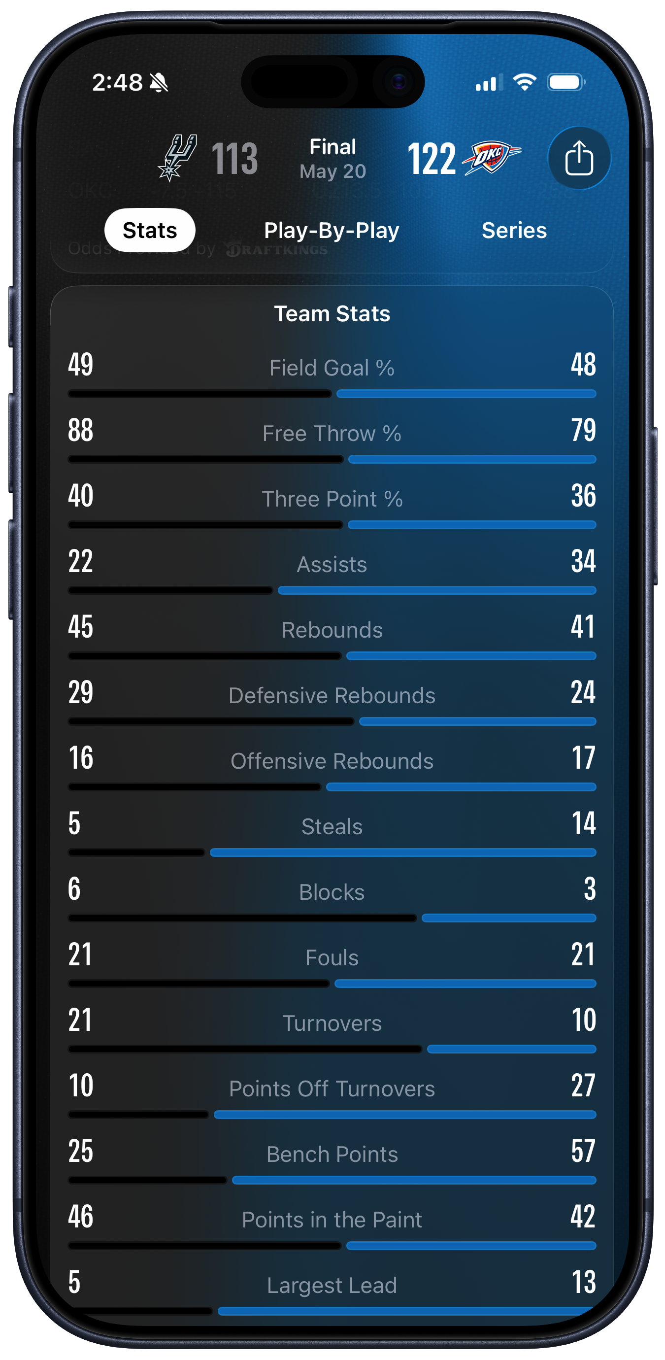
Stats Visualization in Apple Sports
I’ve got some gripes about certain specific aspects of Apple Sports. Like, where does one even start to explain how much is wrong with their zero-sum visualization of team stats? Has anyone ever even seen a presentation like that before?
It has to be seen to be believed. What on earth were they thinking?
Still kind of curious that Apple Sports remains iPhone-only — not even an iPad version — but in a way I find that charming too. Maybe Apple is tight on money?
John is right to call the picture a “Zero Sum” representation. The design strongly suggests to the viewer that, within each row, we’re looking at each team’s share of a total. Each pair of black and blue lines seem to be vying for control of their whole row, with the longest line being the “winner” in each case.
[…]
Literally none of the measures in the Basketball data above are zero-sum in this way. Both teams could shoot 100% from the free throw line, or zero percent. But because the first three measures shown are percentages, this reinforces the zero-sum impression given by the lines. It certainly did that in my case. But then, starting with Assists, the remaining rows are just absolute numbers. When I started looking at the absolute numbers, I got confused a second time by the length of the lines. “Oh so it’s not a share, it’s the value” I thought—but no, they do correspond in terms of relative proportions to the teams share within each row. But they’re not really shares they’re just magnitudes. But they have to be shown in a fixed space and we want to make them relatively comparable somehow so … Argh.
Apple’s software design right now seems to love uniformity. Throw a bunch of disparate statistics—or system settings—in a big list. It looks superficially clean and is easy to code. It seems like there’s a chart that’s illuminating the results, but it’s actually worse than a traditional text-only box score. The numbers that you most want to compare are placed maximally far apart. It’s like reading a table of contents with dual-colored dot leaders, but of course in a table of contents you aren’t meant to be reading all the page numbers.
Our fundamental problem is that we just have two cases (the teams) and fifteen different measures, or variables. Each variable, except for the three percentages, is in effect on its own scale. There’s no direct way to make comparisons across them.
The problem is further complicated by the fact that Apple Sports shows the same screen for all sports, just with different sport-specific stats. I think the solution is to just present these numbers in a table. Yes, tables are boring. But they’re not confusing. What Apple Sports is doing, in an attempt not to be boring, is confusing.
Previously:
9 Comments RSS · Twitter · Mastodon
It's a bit odd for some of the numbers, but it's not fundamentally bad or wrong. I think most people understand that this shows you a rough approximation of how much better one team was than the other at some specific stat. I've seen this type of graph in plenty of videogames and in sports TV shows.
It's a better match for stats like ball possession than for others, but I don't quite understand how it makes people so upset.
Plume said what I was going to say. I've looked at that screen numerous times and never considered how weird it was until everyone started opining about how weird it is. It *is* weird, but it generally succeeds at giving me a quick glimpse at one team's dominance (or lack thereof). After a while, I don't even see the disparity anymore -- just the numbers when I want to look at the numbers, and the graph when I want to glance at that.
Yes, bad UI for multiple reasons:
- if you don't know what you're looking at, you have no way of figuring out what the numbers and bars mean.
- apparently, it requires too much CPU and thinking to clearly show where the middle is so that you don't have to look at the numbers to see which side is best when the numbers are close.
- horizontal gradient when the light is supposed to come from the top.
- it's quite dumb that you can't really read the numbers for both sides at the same time because the numbers are on the left and right borders of the screen.
@billyok It makes it hard to read the numbers and labels because they’re spread apart, and I think it’s misleading. For example, if you look at “Free Throw %” the difference was 88 vs. 79, which could actually be a rather significant difference (depending on the number of shots, which it doesn’t show). But with the chart I can barely tell which bar is longer. It’s like they’re normalizing against the full 100% range, or perhaps the sum of 167, for numbers that are typically between maybe 65 and 90. The chart is communicating that the two numbers are very similar, which I don’t think is the right conclusion.
I don't get the fuss either. The bars appear to be correctly proportional to the overall stat shown. Makes sense to me. If anything, it's weird that the left side team has a black bar when the background of the app is black. Makes it look like there's no bar. The blue bar looks slightly thicker as well, but maybe that's an optical illusion. I do agree with @someone that it should have a tick mark in the middle of each bar.
I also don’t see the problem — the point of this visualization is comparison at a glance.
We do the same thing in stock charts. The point is that you’re looking at relative strengths. If you want absolute numbers, you can look at the numbers, I suppose, but it usually comes down to comparisons. A stock vs the market, the stock compared to yesterday. It’s percentages. It’s about relative strength.
Generally here, the bigger the line on one side (except maybe fouls, though that could be argued), the better that team is doing. The colors in the screenshot match the team colors, in case anyone’s wondering.
The absolute numbers are really less important or is not really the point here.
All visualizations leave something on the cutting room floor because we only have two or three dimensions to display things in ( X, y, color). So you gotta prioritize.
It’s like they’re normalizing against the full 100% range, or perhaps the sum of 167, for numbers that are typically between maybe 65 and 90.
Okay that’s fair, but likely not Gruber’s point. You could put FT% in two bar graphs, one above the other, & Grubes would (?) be happier but, I’m deducing, you wouldn’t. His is that 10+13 assists is not a whole, so why would you display each team’s percentage of it?
Though I get the bad normalization critique, I’m disposed to agree with most of the folks here that, by itself, the “forced whole” isn’t that bad and actually pretty useful for comparisons if you know “comparisons are not necessarily scaled to importance”.
I guess we’d have to come up with a better way to display the data in the same amount of space to really rake them over the coals.
Reading about this tells me how little I care about sports. Is have to do done serious homework before I could have an opinion on those bars