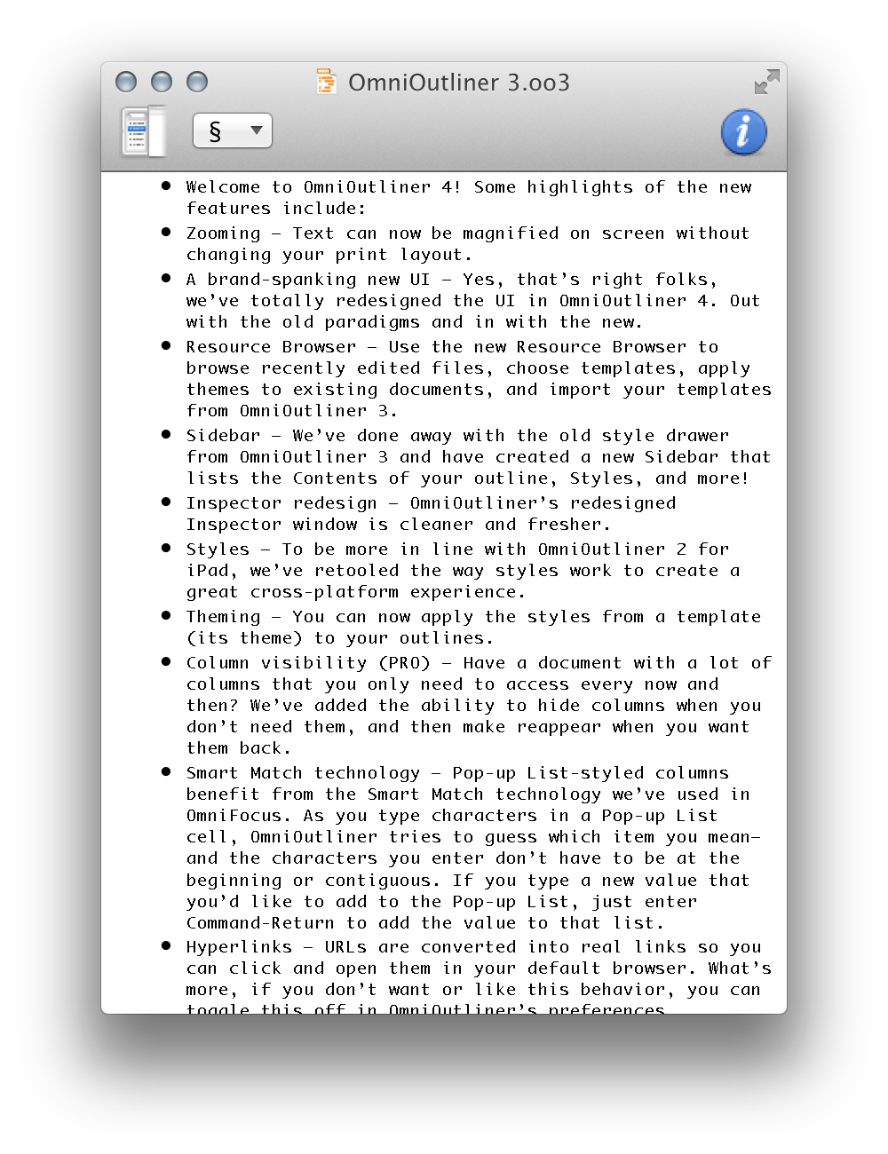
OmniOutliner 4
I’ve been a happy OmniOutliner user since version 1.0, but I have not really been following its development that closely. Lately I have been using more plain text lists, and version 3 has long done pretty much everything I’ve wanted in a comfortable, reliable way. So I did not know what to expect when I downloaded version 4 to see what was new. This release seems to mostly focus on the user interface and code modernization, rather than on outliner features. Here are some of the first things I noticed:
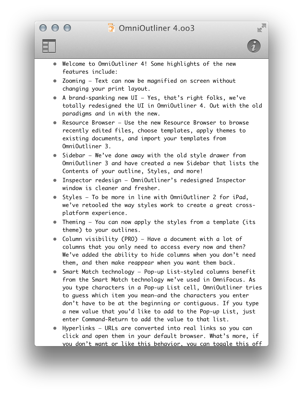
I miss the drawer, which was easy to toggle with the toolbar button. In version 4, the window resizes (on the left) when you hide or show the sidebar, so the toolbar button moves out from under the cursor. This is so maddening that I’ve removed the button from the toolbar and switched to using the keyboard shortcut.
The useful pop-up menu in the toolbar for displaying the section list has been removed.
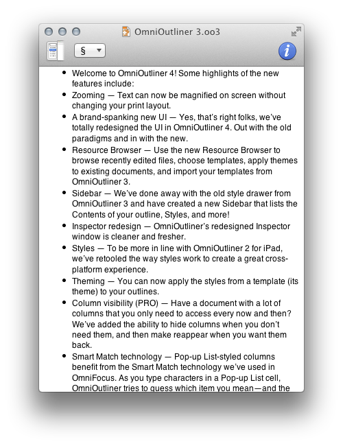
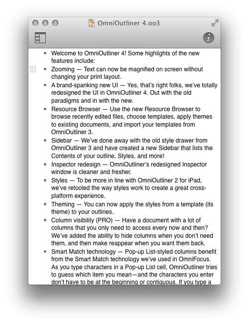
My old documents were displayed with much more row spacing, so I couldn’t see as much content at once. It looks like the Pro version is now required if you want to tighten up the layout. (Even then, the spacing does not seem quite the same.)
The Esc key now triggers auto-completion rather than taking you in or out of edit mode, but there’s a preference to get the old behavior back.
The inspectors have been completely redesigned and seem much simpler now. If, as it seems, all the old features are still there, this is a major achievement. More approachable, less clicking around.
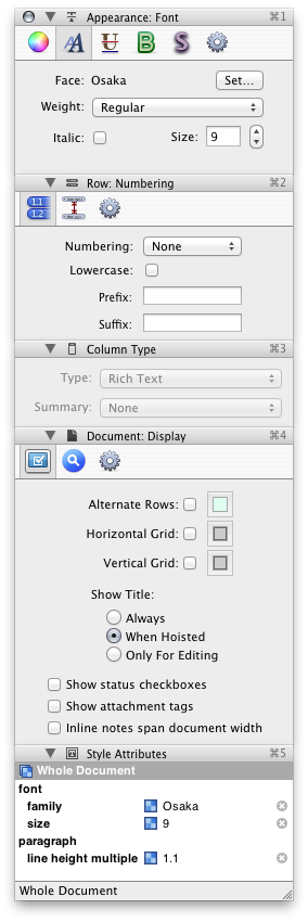
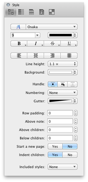
Styles work differently. The new way is initially confusing to me, as I was used to the old interface. I have not used it enough yet to determine whether the new design is an improvement.
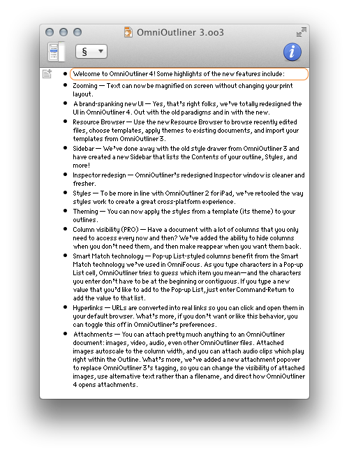
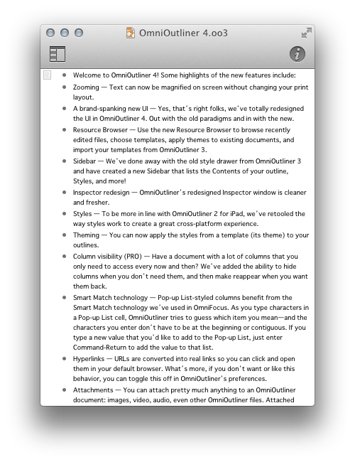
As with Xcode 5, OmniOutliner no longer seems to be able to display bitmap fonts properly. Many of my outlines have long used Osaka 9, without font smoothing. Instead of sharp (albeit not pretty) text, it now appears muddy:
With larger sizes and font smoothing, standard fonts like Helvetica 12 look similar in both versions:
Monaco 9 is another of my favorite fonts that no longer looks good:
However, with Retina the tables turn and the new version looks much better:
Update (2014-01-22): OmniOutliner has switched to using the system window restoration feature. This means that if you quit and relaunch OmniOutliner, it remembers which documents were open and puts them back the way they were. However, if you simply close one document and then reopen it later, it no longer opens back up in the same place.
Update (2014-02-04): Dr. Drang:
For years, the lack of this simple control was what I hated most about OmniOutliner. It always displayed the outline with one pixel equaling one point, a poor choice when monitors commonly run at 120 dpi or greater. Font sizes that were comfortably readable on screen came out childishly huge on paper or PDF; sizes that looked good in print were unreadable on screen. The zoom control allows the best of both worlds.
Update (2014-06-27): In OmniOutliner 4.1, the row padding feature no longer requires the Pro version.
3 Comments RSS · Twitter
I'm a bit doubtful about the use of a segmented control to replace a checkbox (e.g. Start a new Page). But it sure helps for the layout.
@someone Agreed. Also, I wonder if it’s a non-standard segmented control, because it doesn’t match the graphite system appearance that I’ve selected.
[...] when I’m scanning, while showing much less actual information in the same amount of space. (OmniOutliner 4 also reduced its data density, but it included options in the Pro version to tighten up the [...]