Jeff Johnson:
Wait, what? macOS Tahoe beta 2 automatically enabled FileVault and uploaded a recovery key to iCloud.
I did not have a choice in the matter.
First, they silently enable iCloud Keychain, then they upload your FileVault key to it without asking.
Sarah Reichelt:
Beta 1 did this too. I turned it off immediately.
I’m not sure what’s going on here. This did not happen to me with either beta 1 or beta 2 (booting from an external drive). That said, I consider it a dark pattern that there’s still no way to opt out of storing your FileVault key in your iCloud account once and for all. I have to keep unchecking that option in the setup assistant, and it’s easy to miss if you’re just trying to get through all the pages as quickly as possible.
FB18310782:
When upgrading to macOS 26 Tahoe, the auto enabling of FileVault during Setup Assistant with no way to disable/not enable FileVault breaks personal setup of a device that is used as a personal home server that maybe headless.
[…]
I need to be able to restart the Mac Mini “server” remotely and have it come back up automatically to a full booted state without putting in a password for a local user to get services back up and running.
Previously:
Update (2025-06-26): Update (2025-06-26): See also: Hacker News.
Dark Patterns FileVault iCloud iCloud Keychain Installer Mac macOS Tahoe 26 Privacy
Andrew Cunningham:
We are not highlighting this second round of developer betas because we think you should go out and install them on the Macs, iPhones, iPads, and Apple Watches that you use daily. These are still early versions, and they’re likely to have significant performance, battery, and stability problems relative to the current publicly available versions of the software.
But generally speaking, these second developer builds are the first ones I install on my secondary test devices—a collection of mostly older devices that have been replaced but are still considered current enough to run the new update.
The official release notes don’t seem to say what’s new in beta 2. After day of waiting for Software Update to show the new build, I finally gave up and downloaded the full installer.
Michael Flarup (MacRumors):
We did it! New finder icon in Tahoe beta 2!
Zac Hall:
The issue? Finder has a dark side and a light side. The dark side is located on the left half of the face while the light side makes up the right half. Finder in macOS Tahoe 26 reversed this arrangement (while using an outline effect around the right side).
Juli Clover:
In macOS Tahoe Beta 2, Apple included a new option to add a background to the menu bar, making it possible to have a menu bar design that’s similar to the menu bar in macOS Sequoia.
John Siracusa:
Mmmmm…settings…
Joe Rossignol:
The second beta also gives a fresh coat of paint to the Migration Assistant app icon.
John Siracusa:
I think we need to talk about what has happened to Disk Utility.
Basic Apple Guy (Hacker News):
With this release being one of the most dramatic visual overhauls of macOS’s design, I wanted to begin a collection chronicling the evolution of the system icons over the years. I’ve been rolling these out on social media over the past week and will continue to add to and update this collection slowly over the summer.
Jack Wellborn:
Five thoughts on Tahoe’s Safari monstrosity that @siracusa shared via ATP show notes[…]
Steve Troughton-Smith:
I think the Journal app in macOS Tahoe is the first first-party Mac Catalyst app to rely on rich text editing, traditionally a pretty weak spot along Catalyst’s API surface (text editing and document management in general). Hopefully that kind of dogfooding will finally close that gap.
Previously:
Update (2025-06-25): Dan Counsell:
While the Finder icon is improved on beta 2 of Tahoe, I do still wish they’d gone with something closer to @flarup’s rendition of the icon 🥹
Dan Counsell:
And @louie made this version in Icon Composer that’s arguably even better, and honours the original 🥰
Stephen Hackett:
I know some folks (cough, cough, John Siracusa, cough) want Apple to go even further and make the lighter color on the right extend all the way to the edges of the the icon, which would look something like this very rough mockup I did in just a few minutes[…]
I can understand that, and the desire for the line between the two halves of the icon to be more rounded as it is in macOS Sequoia. However, Apple’s current Finder icon works well for me[…]
John Gruber (Mastodon):
The Tahoe beta 2 Finder icon is slightly better, but seeing it this way makes it obvious that the problem with the Tahoe Finder icon isn’t whether it’s dark/light or light/dark from left to right. It’s that with this Tahoe design it’s not 50/50. It’s the appliqué — the right side (the face in profile) looks like something stuck on top of a blue face tile. That’s not the Finder logo.
Louie Mantia:
As a person who used to make app icons at Apple, I don’t think the situation is that the designer doesn’t know, but rather the decision maker who is supposed to have taste doesn’t know. (If this person isn’t Alan Dye, then that’s even more embarrassing for him that he’s not the person making that call.)
Also, slightly purpler is better. More Mac, less Mail / Safari like I said before.
Rui Carmo:
Sometimes designers want to make their mark so bad on a project they go and gloss over either tradition, established branding or earlier styles that were there for a reason, and the updated Beta 2 icon still does not look like the Finder to me, even if I squint at it without glasses.
Riccardo Mori:
The new Migration Assistant icon is a fucking joke. Meaningless. Maybe it can work in an airport to mark an emergency exit or something.
The old one is so simple and clear. From an ‘old, now inactive’ system to a ‘fresh new one’. Migration, indeed. Right there.
Jonathan Wight:
Feels weird to see Apple tossing decades of beautiful iconography down the drain for what seems like… bad generic clip art.
Steve Troughton-Smith:
Can of worms aside… I’ve been thinking it since WWDC, but Liquid Glass on macOS really feels broken without the fluid animations on iOS, much in the same way a screen without touch ‘feels broken’. So many more state changes in the OS seem like they need some kind of animation or transition, and the new design language asks questions of the Mac that it’s just not ready to answer.
Cabel Sasser:
i know this is nitpicky potatoes but this interaction between the macOS Tahoe Finder’s sidebar and status bar is truly wild.
it’s an extremely hard problem to solve! when you suddenly “float” a thing that has to sit directly next to lots of weird things
John Siracusa:
As requested by @rvr, here’s a control sample from Lion, the reimagined Lion by @realmacdan, Sequoia, and Tahoe beta 2.
Dave Nanian:
Using a custom NSSegmentedCell for an NSSegmentedControl on Tahoe, the overridden NSSegmentedCell methods are not called however, using they are called using the exact same code on Sequoia
Update (2025-06-26): Dave Nanian:
NSAlert constantly throwing constraint errors on Tahoe (FB18020308) is lots of fun[…]
Update (2025-06-27): Mario Guzmán:
I mean, just compare Music under Sequoia and Music in Tahoe. One is clearly easier to read than the other one. It is also far less distracting. I can tell you it isn’t Music under Tahoe.
[…]
I’ve been an iTunes user since 1.0 under Mac OS 9.x. This is the biggest UX regression in its entire 24 year history. Sigh. 😔
Pierre Igot:
[The Finder icon] might be better than in beta 1, but the edges now look fuzzy as hell… At this rate, we’re going to end up with macOS 26 “Cotton Ball” Tahoe. And everyone’s going to waste their time rubbing their eyes and cleaning their eye glasses all day long.
Norbert Heger:
What’s really great about these early Aqua designs (the buttons in particular) – they looked translucent without actually being translucent. So they looked cool and glassy but also had perfect legibility at the same time.
Gus Mueller:
The new Safari on Tahoe is so bad I’ve switch browsers for the first time in … fuck, when did Safari come out?
Steve Troughton-Smith:
Safari seems to be capable of viewing fewer and fewer sites, sans performance issues, with each OS release 😪 I feel like I’m back in the early 2000s.
It’s sad.
Update (2025-07-01): Mario Guzmán:
This is sort of what I was afraid of in #macOSTahoe. There are inconsistencies even with menu items consistent across all apps, like the About… menu item.
Some of Apple’s apps don’t have an icon. Some do, it is the “i” in a circle. Then you got Photos which luckily has a Photos icon in SF Symbols they can use.
Mario Guzmán:
Feels like the entire “design” of the new playback controls in Tahoe’s Music app are due to consequences of their new design. The lack of space & clarity turned everything into more clicks & barely visible controls/labels.
You now click to open the volume slider. But you hover to open the playback track slider. There’s an Action Menu (but you can only see it if you have Hawk eyes).
Track/playback timestamps are impossible to read. Pressing the Up Next button yeets everything off to the side.
Alexander Deplov:
The volume control covers up the other buttons, wow!
Joe Rosensteel:
One of my beefs with the Tahoe icons is that in many cases they reproduce simplified forms of existing icons in a glass material without considering what the result is communicating—absent knowing the lineage. The App Store is a series of haunted popsicle sticks because it used to be tools that formed the letter “A” for “App” the podcasts icon was a simplified form of a person with lines radiating outward indicating they were broadcasting so it becomes a series of overlapping circles as a lamp.
Michael Flarup:
How do you like your new trash can?
Brent Simmons:
I’m wondering what I’d have to reimplement in order to provide a setting in the Mac version of NetNewsWire to turn on/off Liquid Glass.
Adrian Schönig:
TIL that the “Here’s to the crazy ones” text disappeared from the TextEdit icon over 10 years ago. I thought it was still on there and was about to rant about it disappearing in Tahoe. Ah, well. That was such a nice touch.
Previously:
Update (2025-07-04): BasicAppleGuy:
macOS Icon History
Maps 🗺️
Dave Nanian:
Apple friends: we’re seeing a problem in Tahoe where if a Mac is in Dark Wake, and our schedule is set to run, we kind of start and then hang.
Update (2025-07-07): Manton Reece:
Minor nitpick in macOS Tahoe, the selected tab in Terminal is very subtle. Seems a usability step back from previous macOS releases. I might need to switch to a third-party terminal app again.
Marco Arment:
Honestly, this is making Terminal (and Safari) in Tahoe VERY hard for me to use.
Tabs in Tahoe are extremely difficult to distinguish from each other and from the active tab.
I’ve never switched away from Safari, and I’ve never investigated third-party terminal apps, but if this ships in the fall, I’ll most likely need to do both. And I really, really don’t want to.
Please, Apple, fix your design. Computers aren’t passive “content” viewers — they’re tools.
Jeff Johnson:
I opened Control Center on macOS Tahoe for the first time, and wow, most of the controls looked disabled.
Guy English:
MacOS 26 has exposed some manual retain release bullshit I’d skated by on for fifteen or so years? Pretty sure the thing blowing up used to be luckily in the same auto release pool as the thing it was calling removeObserver: on. Oops.
Alan Dye Catalyst (Marzipan) Control Center Finder Icon Composer Icons Journal Liquid Glass Mac macOS Beta macOS Tahoe 26 Memory Management Menu Bar Migration Assistant Music.app Safari Software Update Terminal
Juli Clover:
Apple provided developers with the second beta of iOS 26, introducing the first changes and refinements to the new operating system since it debuted after the WWDC keynote. Because we’re early in the beta testing process, there are quite a few tweaks to iOS 26, which we’ve rounded up below.
The official release notes don’t seem to say what’s new in beta 2.
Dave Mark:
I’m a big fan of iOS 26 beta two.
Apple made lots of lovely tweaks. Especially where liquid glass is concerned.
One tweak made Control Center more opaque, easier to read (see pic).
Juli Clover:
The Control Center buttons are now slightly more opaque, making it easier to see the different control options even on a multicolored background. The new, more opaque look is apparent with the standard app icons and the glass icon style.
Zac Hall:
‘Alt 1’ ring tone is now present under Reflections. This was previously discoverable in code but not visible in Settings. The presentation is still odd and certainly incomplete in beta.
Unknown senders uses a blue notification badge instead of a red notification badge to distinguish between the two types of alert badges.
The iOS 26 wallpaper also now uses a parallax effect that was absent during beta 1.
[…]
Safari controls within the More Menu (…) have been reorganized with different sort order and icons (but same functionality).
Marco Arment:
The Liquid Glass toolbar in Music has NOT noticeably changed its legibility with colorful artwork behind it.
Simon B. Støvring:
NOOOO, WHAT ARE YOU DOING, APPLE? Why aren’t app icons centered in the iPhone’s Dock when there are only two app icons in iOS 26 beta 2?
Previously:
Update (2025-06-25): Juli Clover:
With the launch of iOS 26 and HomePod Software 26, Apple is adding support for Crossfade, an Apple Music feature that improves transitions between songs.
Juli Clover:
Image Playground lets you type in any phrase to generate an image in one of three non-realistic styles. You can also select pre-determined scenes and props that Apple suggests, and generate images featuring your friends and family. It’s these images where you will see the biggest difference in iOS 26, because the content generated based on images of people has changed quite a bit.
Update (2025-07-01): Jesse Squires:
I really want to like Liquid Glass, but goddamn.
iOS 26 Books app[…]
Previously:
Control Center Design Dock HomePod Image Playground iOS iOS 26 iOS Beta Liquid Glass MobileSafari
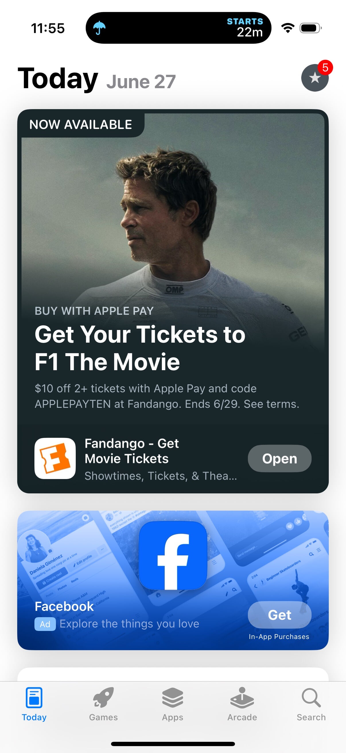
Casey Liss:
🤮

In case you forgot after F1 got multiple sections of the keynote at Apple’s developer conference.
Marco Arment:
This is a core system app interrupting you, promoting a sale by a movie-ticketing company, to push you to go see the platform vendor’s new movie.
Why not just pop up random ads all the time, always creating new channels that everyone’s opted-into by default so you can never keep up with opting out of them all?
Oh wait, that’s already what happens.
You can’t opt out because the Wallet app also shows notifications that are actually important.
And non-notification ads are mixed in everywhere now: the services apps, System Settings, etc. (I also got the F1 ad as a banner within the Wallet app.) You could make that case that people don’t know about the different services and the content that they offer and so this is helpful onboarding. But this has been going on for years with no way to opt out. We’re long past the point where key system apps have become nagware. I need extra taps/clicks to get through the ad and just play my music. Screen space is wasted showing thumbnails for movies and articles that are not available to me instead of the ones that actually are.
Previously:
Update (2025-06-25): Dave Wood:
Carrot on top of it as always!
Joe Rossignol:
Some of the iPhone users who received the push notification have complained about it across the MacRumors Forums, Reddit, X, and other online discussion platforms.
“As far as I can tell, Apple is now just sending me ads to my screen now as push notifications, something I hate with an absolute passion and disable across the board in every app that tries this,” said one person who received the notification.
Some people are especially upset about receiving a push notification ad through the Wallet app because it is a very important app for personal finances, so simply turning off notifications for the entire app is not a feasible solution.
Worse, Apple seems to be ignoring the guidelines that apply to App Store apps.
Kerry:
There’s a wallet notifications setting to disable offers and promotions. 🙃
This is only in iOS 26, and it’s hidden behind the ··· menu—lately I’ve been seeing this called the meatballs menu, I guess as a take off the hamburger menu—rather than in the notification settings.
Warner Crocker:
Granted there aren’t too many who lust for the ever increasing onslaught of advertising and marketing pitches we’re bombarded with hourly. I’m certainly not one who does. But advertising and marketing, as overused and overwrought as it has become, in and of itself isn’t enshittification, no matter how fast it grows like weeds rapidly enveloping every corner of our Internet usage.
M.G. Siegler:
Look Apple, we get it. You really, really, really, really want F1 to be a hit. And after a series of feature film flops, you really need it to be to maintain any level of credibility in the space. The Apple TV+ shows have been, for the most part, great. The movies, prettymuchtheopposite. That’s obviously somewhat subjective, but it also matters for things like word-of-mouth. And that matters more than it normally would for Apple’s movies because they’ve inexplicably been so bad at marketing them.
[…]
This is not the first time Apple has dabbled in promotion for Apple Pay and their partners, of course. But it is the first time they’re hitting this trifecta: using their device to push their service and their movie. It’s a bit much. But it’s also just a push notification (and a notice in the Wallet app), you can just shoo it away, right? Sure, but there’s also clearly a reason why this backlash keeps bubbling up.
As I wrote last night (referencing the most famous linewritten by Jonathan Nolan): You either die ranting against inserting ads or live long enough to start inserting ads.
[…]
But again, the problem is their previous rhetoric against this general business. One imagines that they’ll try to use the “intrusive” and “personal data” distinction, but those are semantic lines that will fade eventually. If Apple does indeed keep pushing more into ads, they’ll also keep doing things to make those ads more effective. They already failed in the space once with ‘iAd’, and much as with F1 itself, they can’t afford to fail again. If and when Tim Cook is no longer CEO, that could be the perfect timing to fully revisit previously precious stances…
For now, we just have the scent of hypocrisy and the appearance of greed with these ads. Again, I’m not sure it’s the latter – I think they just really, really, really want and need F1 to be a hit and are pulling out every advertising stop that they can, including on their own properties. But it’s no less hypocritical.
Update (2025-06-27): John Gruber (Mastodon):
What supplies are running out on this promotion? Why add that “terms apply”? This is just a shit notification from top to bottom, putting aside whether any such notification should have been sent in the first place.
[…]
(a) iOS 26 is months away from being released to the general public — there exists no way to opt out of such notifications now; and (b) at least for me, I was by default opted in to this setting on my iOS 26 devices.
This was such a boneheaded marketing decision on Apple’s part. They cost themselves way more in goodwill and trust than they possibly could have earned in additional F1 The Movie — wait, sorry, my bad, F1® The Movie — box office ticket sales. It’s like Apple got paid to exemplify Cory Doctorow’s “enshittification” theory. Apple Wallet doesn’t present itself as a marketing vehicle. It presents itself as a privacy-protecting system service.
John Gruber (Mastodon, Hacker News):
It’s a fact that no company can inject an ad into your physical wallet. It just can’t happen. So if Apple’s message to users is that they should trust Apple Wallet, and move more of their “shit that goes in your wallet” life from their traditional analog wallet into their digital Apple Wallet, that’s the bar. No ads, ever. They’re competing against the privacy and intimacy of one of the most personal things people carry with them.
[…]
I’m 99.9 percent certain this F1 ad was just blasted out to zillions of Wallet users indiscriminately, but some number of users who got it — especially people who know they’re in the demographic for the movie — surely think they got the ad because Wallet is tracking their interests and activities. Like, what if you recently bought tickets to see another summer blockbuster movie? Using Apple Wallet? And then you got this ad? It’d be completely sensible to be spooked by that, and conclude that Apple Wallet is tracking you.
So much for the notion that it doesn’t matter how much money and attention Apple’s spending on TV content because it doesn’t affect their core products. It turns out they’re fully willing to strategy tax their brand equity because the movie business hasn’t been going great and they need this one to be a hit.
Previously:
Update (2025-07-01): Francisco Tolmasky:
Obviously old news now, but one thing that is particularly baffling about the F1 ad blunder is how low stakes the potential upside was. It would be one thing to send an ad out about the new iPhone, or even the Vision Pro… but some nothing movie that will absolutely be forgotten about in 3 months and whose entire demographic is “dads”? Really? That’s what you blow your trust capital on? One thing that is certain is that the F1 ad debacle will be remembered for far longer than the F1 movie.
Jonathan Wight:
Maybe spend 0.01% of that F1 movie marketing budget on fixing the Apple Bluetooth stack.
John Gruber:
This is all the work of ham fisted marketing doofuses. And it’s not consistent. Here’s the ad getting tons of play in the App Store[…]
Geoff Duncan:
This isn’t as egregious as Apple’s F1 promotion via Apple Wallet and there are a zillion more important things happening, but Apple has again chosen to spam Logic Pro users.
M.G. Siegler:
Well, it seems to have worked. At last – as long predicted – a box office victory for Apple. Well, call it winning lap one, perhaps. Still a win is a win. And the F1 opening box office results are clearly a win, per the numbers Pamela McClintock is reporting for The Hollywood Reporter[…]
Update (2025-07-07): Hartley Charlton:
Apple’s latest original film, “F1: The Movie,” has become the company’s highest-grossing theatrical release to date, earning over $293 million globally within ten days of release, Variety reports.
Update (2025-07-08): John Gruber:
At least here in the US, if you just opened the TV app on iOS 18 last week, you were presented with this full-screen ad (replete with all those dumb ®’s, despite Apple’s ads for the same thing in the App Store omitting them).
There were two buttons to choose from: “Not Now” and “Buy Tickets ↗︎”. If you tapped the “Buy Tickets ↗︎” button, boom, you just jumped to the F1 The Movie website in your default browser.
[…]
The hypocrisy isn’t that Apple didn’t show a full-screen scare sheet for this link-out to the web. It’s that they require other developers, who are doing it to sell digital content, to show a scare sheet/confirmation.
[…]
Is it inherently confusing to have a button in an app that jumps you out of the app to your default web browser (probably Safari, especially for people who might be confused) to complete a transaction, without a scare sheet or even a confirmation alert? I can see the argument that Apple’s answer is “Yes, it’s potentially confusing for many users”. But I can’t see the argument that the answer is “Yes, it’s potentially confusing for many users, but only if they’re trying to buy in-app content or subscriptions, but not confusing at all if they’re trying to buy, say, movie tickets.”
The other odd bit is that, despite all the promotions on Apple devices, you can’t actually watch the movie on your device.
Update (2026-02-06): Tyler Hall:
If Apple had shipped their car project…
Advertising Amazon Web Services Apple News Apple Pay Apple TV+ iOS iOS 18 iOS 26 Mac macOS 15 Sequoia Movie Notification Center Privacy Push Notifications Stocks Strategy Tax Wallet
Joe Rossignol:
Apple today shared The Parent Presentation, which explains why a Mac is a useful tool in college. The customizable 81-slide presentation is available in PowerPoint, Keynote, and Google Slides formats. After downloading the template on this page, you can fill in your name and some other key details, and make other edits to your liking.
The presentation mostly contains tongue-in-cheek comments, but it also outlines a few real benefits of Macs, such as the MacBook Air's portability.
In an accompanying YouTube video shared by Apple, comedian Martin Herlihy shows a group of high school students how to effectively use The Parent Presentation.
Joe Rossignol:
Apple has marked as private its day-old The Parent Presentation video on YouTube, meaning that it is no longer available to watch.
Apple has also moved The Parent Presentation to the bottom of its College Students page, effectively burying it. When we reported on the marketing campaign yesterday, the presentation was prominently featured at the top of the page.
John Gruber:
I wouldn’t describe it as “cringe”, but I also wouldn’t describe it as “funny”.
[…]
It’s also not the least bit offensive, so it really is unclear why Apple pulled it.
[…]
One obvious problem with “The Parent Presentation” video is that the gist is that everyone involved is stupid: high school kids (the ostensible target audience?) are too stupid to know how to ask their parents for a MacBook for college, parents are too stupid to know they should buy their kids a good laptop, and even Herlihy’s lecturer is a doofus who himself doesn’t know how to deliver a presentation. I don’t know how this got past the concept stage.
To top things off, the downloadable slide presentation — which Apple still has available in Keynote, PowerPoint, and Google Slides formats — is entirely typeset in Arial.
julesme:
Here’s why the ad doesn’t work: It features a shady salesman. The implication is that you have to be shady to convince someone to buy a Mac (which makes no sense given that Apple arguably makes the best laptops, with the highest quality hardware and OS). The tone of the ad is off base relative to the real-world value proposition of a Mac.
The “presentation” is reminiscent of other shady sales pitches, like selling timeshares or any disreputable door-to-door business of the past (expensive vacuums, magazine subscriptions, etc).
I understand it’s trying to be funny (and I also found the comedian to be funny), but the tone and connotation of the ad don’t align with Apple’s brand. Don Draper would not have greenlit this.
It seems to come from the same place as the ad about forgetting the husband’s birthday.
Previously:
Apple Mac Marketing