On the Undesign of Apple Intelligence Features
The flaws in results from Apple Intelligence’s many features are correctly scrutinized. Because of that, I think some people have overlooked the questionable user interface choices.
[…]
Apple is not breaking new ground in features, nor is it strategically. It is rarely first to do anything. What it excels at is implementation. Apple often makes some feature or product, however time-worn by others, feel so well-considered it has reached its inevitable form. That is why it is so baffling to me to use features in the Apple Intelligence suite and feel like they are half-baked.
[…]
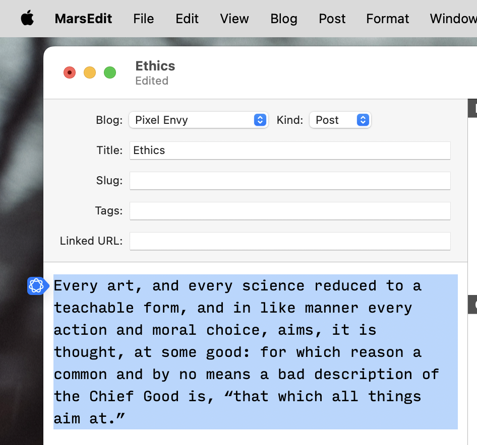
What this looks like on my Mac, sometimes, is as a blue button beside text I have highlighted. This is not consistent — this button appears in MarsEdit but not Pages; TextEdit but not BBEdit. These tools are also available from a contextual menu, which is the correct place in MacOS for taking actions upon a selection.
In any case, Writing Tools materializes in a popover. Despite my enabling of Reduce Transparency across the system, it launches with a subtle Apple Intelligence gradient background that makes it look translucent before it fades out. This popover works a little bit like a contextual menu and a little like a panel while doing the job of neither very successfully. Any action taken from this popover will spawn another popover.
As with Translate, I don’t think popovers work well for large blocks of text that I want to interact with.
I’m sure Apple is pouring everything it can into building better, more modern models, and we’ll hear about that effort in detail in June. But what troubles me most about the Apple Intelligence rollout isn’t that Apple was caught flatfooted by the AI hype train and is struggling to catch up—it’s that Apple’s implementation of AI features also feels slapdash and rushed.
Apple doesn’t have to end up with the best large language model around in order to win the AI wars. It can be in the ballpark of the best or partner with the leaders to get what it needs. But it can’t fail at the part that is uniquely Apple: Making those features a pleasure to use, in the way we all expect from Apple. Right now, that’s where Apple is failing.
Apple has a chance to move A.I. features beyond a blinking cursor in a chat bot — like a plain language command line. Very little of what is out today is a thoughtful implementation of these features. Cleanup in Photos is pretty good. Most of the other stuff — summaries of phone calls, Notification Summaries, Writing Tools, Memory Movies in Photos, and response suggestions in Mail and Messages — are more cumbersome than they are elegant.
Previously:
- Grammarly vs. Apple’s Writing Tools
- Apple Intelligence Enabled Automatically
- Apple Intelligence News Notification Summaries
- Translate in iOS 17 and macOS Sonoma
7 Comments RSS · Twitter · Mastodon
Look, I'm no kind of soothsayer, but when I first heard Apple bragging about "Apple Intelligence", this is exactly what I expected:
"what troubles me most about the Apple Intelligence rollout isn’t that Apple was caught flatfooted by the AI hype train and is struggling to catch up—it’s that Apple’s implementation of AI features also feels slapdash and rushed."
It's not that Apple isn't designing things, it's that they've stopped designing for the platform the software is being used on.
They locked Alan Dye in his office for several years to make the interface for Vision Pro, and now that he's been released, by god the rest of the operating systems will fall in line.
Now we have all these hover-overs and pop-overs and bubbles with no controls and terrible data density. I'm sure they look great on the Vision Pro, but they don't work on the Mac and iPhone and everywhere else they keep getting shoved.
Why are people still surprised that Apple is now a company that sucks at UI/UX just as much as other software developers? There is absolutely NOTHING in Apple's recent track record in software that suggests that they are still capable of producing elegant UI/UX. We all need to resign ourselves to the fact that Apple is no longer a source of elegant software. For AI, they said: “Not first, but best.” Notwithstanding the dubious value of any AI features at this point in time, there's just no way that Apple Intelligence will ever be “best”. They'll never have the “best” underlying technology (which I mean in relative terms, of course, since even the best AI still sucks), but they also will never have the best UI/UX for it either. Those days are over. Coming from Apple, it's now pure advertising bluster with no substance whatsoever. Apple is no longer "insanely great". It's never even "great" anymore. It's just not as bad as the rest (mostly because they are running on the fumes of what their software engineers haven't got around to ruining as well yet). And that's the best we can expect from them these days. The enshittification of Apple started a long time ago. It's still in its accelerating phase.
@Pierre Igot
I can't help but wonder if this same sort of thing would've happened in Jobs survived and was still in control of Apple.
> There is absolutely NOTHING in Apple's recent track record in software that suggests that they are still capable of producing elegant UI/UX.
MagSafe is Qi with much better UX.
AirPods are Bluetooth earbuds with good UX.
Safari figuring out from Messages and Mail “this looks like a verification code” is good UX.
The black backdrop of the 2021 MacBook keyboard and the Dynamic Island are smart design, in that they conceal a problem (“the arrow keys look awkwardly out of place” and “we do need sensors up there”).
I’m frustrated by some recent stuff (the action button settings are… silly; a list would’ve been way more efficient; I’m not sure yet if the complexity of the Camera Control was worth it or a simpler button would’ve been just fine), but… nothing? Nah.
(As for UX under Jobs, anyone remember QuickTime 4’s awful volume control? That felt quite “Steve personally insisted on this” to me.)
Sören: MagSafe does not really have a software component AFAIK. I am talking about software. (Apple is still pretty good at hardware.)
AirPods have a software component, of course, and it's pretty atrocious. The "automatic" switching between devices is horribly unreliable and unpredictable. And the UX with charging buds can be really maddening when anything goes wrong, i.e. when one of the contacts in the charging case fails to work properly and the bud ends up completely losing its charge WHILE IN THE CHARGING CASE. This happens far too often in my experience. And there is no warning from the software that something is wrong. So: hardware flaw + bad software = horrible UX.
Verification codes: my bank has a non-standard web form for entering the verification code, which is not compatible with Safari's automatic filling. So when I get a verification code from my bank, Safari attempts to enter it automatically, and fails. And if the setting to automatically delete such codes after use is on, it automatically deletes the text message with code BEFORE I HAVE HAD A CHANCE TO ENTER IT MANUALLY. How is that a good UX?
I could go on and on. Even in the sofware things that are supposed to be improvement, there are always flaws due to insufficient testing of real-life scenarios. (My bank is one of Canada's major banks. It has millions of customers.)
Nobody knows for sure that Steve Jobs would have stopped this enshittification from happening, but it's been happening unabated for years now under Tim Cook's watch. To a old timer like me who became a Mac user in 1987, it really feels like nobody at Apple really cares anymore. And it might be because there is no one like Steve Jobs actually trying to use the stuff and screaming: "THIS IS SHIT!!!"