Every Google Result Now Looks Like an Ad
Craig Mod (via Hacker News):
There’s something strange about the recent design change to google search results, favicons and extra header text: they all look like ads, which is perhaps the point?
In 2007, Google changed the long-standing shaded background indicating the ads section of the page from blue to yellow. In 2008, it then briefly tried a green background before reverting back to yellow. Google continued to test variations of background colors including bright blue and a light violet. In 2010, violet officially replaced the yellow, but only lasted about a year before yellow reappeared in 2011. In 2013, Google tweaked the yellow to a paler shade, which would close out the era of background shading.
At the end of 2013, Google removed the background shading and began testing a yellow ad label next to each text ad. The yellow “Ad” label rolled out globally in 2014 in a much smaller size than first appeared in the initial testing. In 2016, a new green label marked the first time the color of an ad demarcation matched the color of an element in both the ads and organic listings: the display URL. A year later, Google kept the green, but inverted the treatments so that the font was green with a thin green border on a white background. This year’s update to the black label does away with the border altogether. The display URL is now black to match the label.
Here’s a timeline.
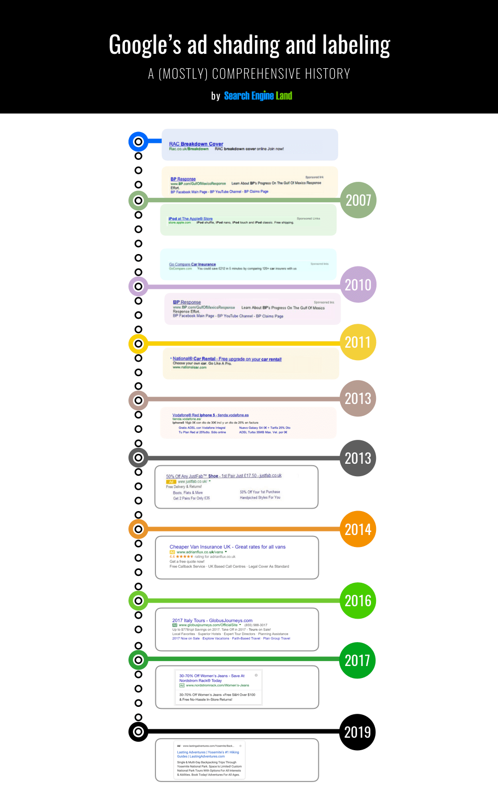
Update (2020-01-24): John Gruber:
To say that this design blurs the line between real search results and sponsored items is an understatement.
Last week, in its own breezy tweet, Google sought to spin the shift as quite the opposite — saying the “new look” presents “site domain names and brand icons prominently, along with a bolded ‘Ad’ label for ads”[…] But Google’s explainer is almost a dark pattern in itself.
Early data collected by Digiday suggests that the changes may already be causing people to click on more ads.
Dieter Bohn (via Hacker News):
Today, I still trust Google to not allow business dealings to affect the rankings of its organic results, but how much does that matter if most people can’t visually tell the difference at first glance? And how much does that matter when certain sections of Google, like hotels and flights, do use paid inclusion? And how much does that matter when business dealings very likely do affect the outcome of what you get when you use the next generation of search, the Google Assistant?
And most of all: if Google is willing to visually muddle ads, how long until its users lose trust in the algorithm itself?
Update (2020-02-22): Luke Kling:
I’m old enough to remember when Google was pushing us to not show ads above the fold and focus on good content for the user.
Here is everything above the fold on my latest Google search.
Update (2020-02-26): Damien Petrilli:
Google rolled back their new Ad design my ass.
Literally NO difference between results outside the little “Ad”.
3 Comments RSS · Twitter
I just realized I've been using adblockers for so long that I don't recognize any of the google ad formats from the past 5 years or so.
[…] Mir gefällt, wie Michael Tsai die Situation mit den Ad-Labels bezeichnet. Er dreht den Spieß um und meint in seiner lesenswerten Zusammenfassung: Every Google Result Now Looks Like an Ad. […]
I’ve been using Bing for 5 years, and have been totally happy, so I haven’t even noticed Google’s ad changes (and I’ve always thought they were hideous).