End & Accept, Decline, Hold & Accept
Brenden Mulligan, on the three choices given when you’re on an iPhone call and a new call comes in:
These options break my brain every time.
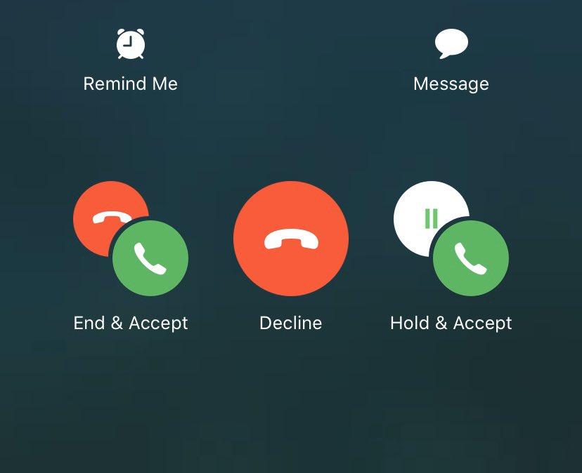
The issues:
1. It’s unnecessary decision making in the 10 seconds before the new call goes to voicemail
2. It’s too specific about what’s going to happen to the current call
[…]
This is an interesting one because you don’t see this in a stress free state. You see it while juggling at least one other task, and you have time pressures, etc. and you don’t see this UI very often.
I find this confusing, too. One issue is that the language isn’t parallel. In two of the choices, the first word applies to the current call, but in the other one it applies to the new call. Keeping the current structure, I think it would be clearer to have either:
- Accept & End, Decline, Accept & Hold
- End & Accept, Keep & Decline, Hold & Accept
I also find the icons too hard to interpret quickly. One issue is that the red circle with the hung-up phone doesn’t mean the same thing in both cases.
[This] screen breaks the muscle memory. We don’t panic when the first call arrives because there are two clear options (if the phone is unlocked) – Accept on the right and Decline on the left.
Whereas, now Decline is in the middle.
[It’s] the same exact location as the big red end button that does end the current call before (and after) the incoming call arrives.
The big red phone button in the middle is deeply encoded into my brain as “end call”. I’d rather see a big X or sth to signify declining another call.
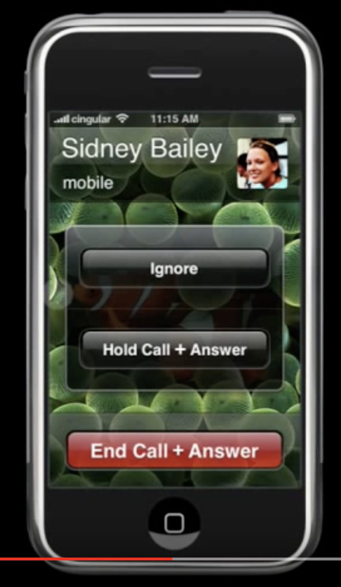
Took me a while to find it, but I knew in my gut that Apple had completely knocked this one out of the park — in 2007.
[…]
Watching and listening to the incoming call in the video, it is even more clear. You have a thing — the current call. The current call has an End Call button. A new thing arrives — the incoming call. Two options for new thing that don’t end the existing thing are grouped.
This is so much better. No confusing icons, and the red button consistently means to end the current call.
Update (2021-12-13): Panagis Galiatsatos:
Why count backwards by 7 when this is the true test of attention and cognition 🤦🏻♂️
Update (2023-01-05): See also: Felix Krause.
8 Comments RSS · Twitter · Mastodon
Gruber's diagnosis of the problem hits the nail on the head.
Also: amazing how much clearer the v1 UI was.
I feel the same slight confusion and time pressure every time I see this too. And wow, yeah the 2007 choices are way clearer. The scary red coloring should be reserved for ending your current conversation, not ignoring an incoming call.
This would be simpler with just two choices, since "ignore" doesn't really need a choice. You could just have the ringing stop very quickly when you're already on a call. The accept/end and accept/hold buttons would remain visible until the call goes to voicemail. To ignore the new call, you glance at the caller ID, and then put the phone back up to your ear and continue talking.
So much of iOS UI has become a confusing mishmash of nonsense since the post Forstall era. For all the pejorative talk about skeuomorphism re earlier versions of iOS, it was way more accommodating of the user than the 'oh so cool' minimalism of Jonny Ive's iOS 7 and beyond. Truly great design is how something works etc etc etc...
I wish I hadn't 'upgraded' my iPhone 4 to iOS 7 back in the day... would be nice to have an offline device running iOS 6 to check in with occasionally for UX comparisons.
[…] mir“-Angaben anderer Nutzer gefolgt sind. Zudem hat der Tweet eine Diskussion darüber angestoßen hat, ob Apples aktuelles Auswahlmenü wirklich der Weisheit letzter Schluss […]