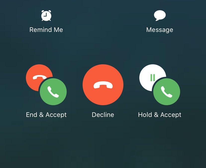
Brenden Mulligan, on the three choices given when you’re on an iPhone call and a new call comes in:
These options break my brain every time.

The issues:
1. It’s unnecessary decision making in the 10 seconds before the new call goes to voicemail
2. It’s too specific about what’s going to happen to the current call
[…]
This is an interesting one because you don’t see this in a stress free state. You see it while juggling at least one other task, and you have time pressures, etc. and you don’t see this UI very often.
I find this confusing, too. One issue is that the language isn’t parallel. In two of the choices, the first word applies to the current call, but in the other one it applies to the new call. Keeping the current structure, I think it would be clearer to have either:
- Accept & End, Decline, Accept & Hold
- End & Accept, Keep & Decline, Hold & Accept
I also find the icons too hard to interpret quickly. One issue is that the red circle with the hung-up phone doesn’t mean the same thing in both cases.
Shekhar Somani:
[This] screen breaks the muscle memory. We don’t panic when the first call arrives because there are two clear options (if the phone is unlocked) – Accept on the right and Decline on the left.
Whereas, now Decline is in the middle.
John Gruber:
[It’s] the same exact location as the big red end button that does end the current call before (and after) the incoming call arrives.
Willi Kampmann:
The big red phone button in the middle is deeply encoded into my brain as “end call”. I’d rather see a big X or sth to signify declining another call.
John Gruber:
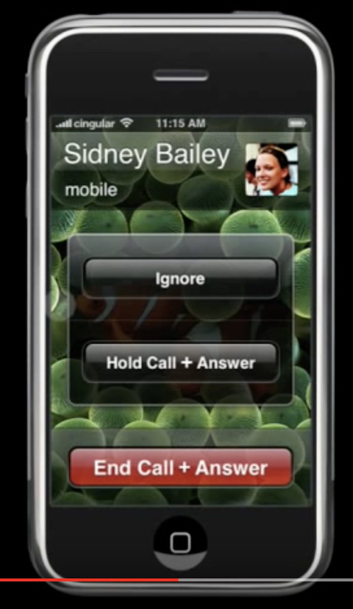
Took me a while to find it, but I knew in my gut that Apple had completely knocked this one out of the park — in 2007.

[…]
Watching and listening to the incoming call in the video, it is even more clear. You have a thing — the current call. The current call has an End Call button. A new thing arrives — the incoming call. Two options for new thing that don’t end the existing thing are grouped.
This is so much better. No confusing icons, and the red button consistently means to end the current call.
Update (2021-12-13): Panagis Galiatsatos:
Why count backwards by 7 when this is the true test of attention and cognition 🤦🏻♂️
Update (2023-01-05): See also: Felix Krause.
Design iOS iOS 1 iOS 13 Phone.app
Chris Baraniuk:
Being a cyber-security researcher, she was familiar with web code so she decided to examine how OneTravel displayed its web pages. (Anyone can do this by using the “inspect” function on web browsers like Firefox and Chrome.) After a little bit of digging she made a startling discovery – the number wasn’t genuine. The OneTravel web page she was browsing was simply designed to claim that between 28 and 45 people were viewing a flight at any given moment. The exact figure was chosen at random.
Via Nick Heer:
Also, many of the biggest travel booking websites are owned by just a couple of companies: Bookings Holdings runs Booking.com, Priceline, Kayak, and Cheapflights; the Expedia Group owns Expedia, Hotels.com, Hotwire, Orbitz, Travelocity, and Trivago. Each group shares the same inventory, and they all use the same tactics. Users simultaneously get the impression that they’re shopping around and competing with other users, when neither is true.
Dark Patterns Travel Web
John Siracusa (tweet):
In classic, when you click on a window that belongs to an application that’s not currently active, all the windows that belong to that application come to the front. In Mac OS X (and macOS), only the window that you click comes to the front.
[…]
Sadly, macOS Catalina’s lack of support for 32-bit apps finally killed the last of the apps that implemented this feature. I was alone in a cold, barren world where I had to click on a Dock icon to switch to an app and bring all its windows to the front.
His Front and Center app lets you choose the classic behavior or, as I prefer, choose the modern behavior and selectively override it by holding down the Shift key when you do want all the windows. There are ways to do this without the app:
- Click the Dock icon.
- Assign a keyboard shortcut to Bring All to Front and press it after activating the window.
- Press Command-Tab, then Left Arrow after activating the window.
But a modified click is more elegant.
Lee Fyock:
Gus knew of a deprecated API that does the process-switching much more efficiently, that doesn’t exhibit the same bug, and makes the code much simpler. Given that the impetus of writing the app was to make the 32-bit to 64-bit transition cleanly, I wasn’t a fan of using an API that had been deprecated in OS X 10.9, but it works well.
Carbon for the win. I, too, have had issues with the newer process APIs.
Previously:
Update (2020-01-10): John Gruber:
So why Shift-click? There really wasn’t any choice — the other single modifier keys are all spoken for by the system.
See also: Accidental Tech Podcast.
Bug Carbon Cocoa Mac Mac App Mac OS 9 macOS 10.15 Catalina

