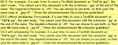
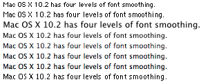
James Duncan Davidson really likes Mac OS X’s anti-aliasing. On the contrary, I find it to be the single most annoying part of OS X. (Yes, it’s worse than the open/save panels and the mostly stateless Finder.) I find the text hard to read and ugly. There’s no way to turn it off system-wide. Some programs, like OmniWeb, let you disable anti-aliasing for their content views, but the resulting Quartz text is so poorly drawn that it often looks
worse than with anti-aliasing. As a result, I use applications like
iCab and
BBEdit that draw their content using QuickDraw and thus can display actual screen fonts. (Sadly,
Mailsmith, uses anti-aliased text for its lists.) Here are some screenshots of Mac OS X’s anti-aliasing, taken from my
ATPM coverage. (Click for discussion.)


Font Smoothing Mac Mac OS X 10.2 Jaguar

