macOS Tahoe 26
Apple (feature list, release notes, security, enterprise, developer, full installer, IPSW):
macOS Tahoe transforms the Mac experience with a stunning new design and powerful capabilities that turbocharge productivity. The new design offers users even more ways to personalize their Mac with an updated Control Center in addition to new color options for folders, app icons, and widgets. The menu bar is completely transparent, making the display feel even larger. With its biggest update ever, Spotlight offers all-new browsing views for files and apps, enhanced search, plus powerful action capabilities to quickly accomplish tasks like sending emails or creating events — all with the help of quick keys. Shortcuts get even more powerful with intelligent actions along with the ability to tap directly into Apple Intelligence models to automate complex tasks. Thanks to Continuity, the Phone app allows users to effortlessly access familiar features from iPhone — including Recents, Favorites, and Voicemails — alongside new features like Call Screening and Hold Assist. With Live Activities from iPhone now appearing directly on the Mac, staying informed about real-time events has never been easier.
The current versions of my apps are compatible. There will be some updates soon to optimize them for Tahoe.
I spent a large part of my weekend making over 150 screenshots, just for you.
Whether you’re installing the upgrade because of those, or in spite of them, allow me to take you on a quick tour of how you can set its interface up, and which controls do what.
There are three sets of controls:
- Appearance mode, Light or Dark, in Appearance settings;
- Display variations to Reduce transparency or Increase contrast, in Accessibility settings;
- Icon & widget style, in Appearance settings.
That comes to a total of more than 20 combinations before factoring in icon tinting colour, so there’s no shortage of choice.
One of the things I’ve loved most about designing macOS icons is how they let you break the frame. A blade, a pencil, a petal. Something reaching out.
With Tahoe, that era is behind us.
I worry how inconsistent macOS is gonna get thanks to Apple and Apple-only indie apps adopting the bubbly new look, while cross-platform apps stay on the classic/functional/flat look. Things weren’t entirely consistent before but many well-crafted cross-platform apps could (and did) feel right at home. That seems unlikely with Liquid Glass.
If you’ve already installed Apple’s 26 OS RCs, it looks like there’s an update. Not at all confusing, the way it’s presented here…
It’s becoming apparent that macOS Tahoe has a number of issues that completely break the Mac App Store for installing and updating apps, some of which that can only be fixed by booting to Recovery mode and using the command line 😅 That is an extraordinary state to launch an OS in.
See also:
Previously:
- Design Is How It Works
- macOS Tahoe 26 RC
- macOS Icon History
- One Size Does Not Fit All
- appleOS 26 Public Betas
- macOS Tahoe Drops FireWire Support
- Assorted Notes on Liquid Glass
- macOS Tahoe 26 Announced
- macOS 15 Sequoia
Update (2025-09-29): Juli Clover (Howard Oakley):
If you have a Mac Studio with an M3 Ultra chip and can’t get macOS Tahoe to install, you’re not alone. There is a bug that is preventing the update from installing properly on machines that have the M3 Ultra.
If you didn’t download the new software yet, here are some features that might entice you to upgrade.
In this article, we’ve selected 50 new features and lesser-known changes that are worth checking out if you’re upgrading. What do you think of macOS Tahoe so far?
Apple apparently addressed in macOS 26 a notoriously longstanding home folder bug with serious security implications.
So now with macOS 26 being final. Why do people still have to jailbreak their Mac (and VMs) to be able to run 3rd party kernel extensions inside VMs?
macOS Tahoe RC, everybody 😅
System Preferences on the Mac is still horrible to use (sluggish, apparently overly dependent on web views, and has at least two different styles of control spacing).
[…]
Relying on the Globe/Fn key for window management was a mistake because it tends to switch keyboard layouts on me, so I guess people at Apple are neither bilingual nor good testers.
For my taste, this standard macOS 26 Liquid Glass treatment muddies the boundary between UI and content way too much.
Apple: “Spotlight now lists all result types … and intelligently ranks them by relevance to you, making it easier and faster to find what you’re looking for.”
Reality: Tahoe removes the information that allows you differentiate app versions.
Interesting. The green zoom button has superfluous mouse-over detection for some reason on macOS Tahoe.
Dmitriy Kovalenko (via Hacker News):
Calculator app has a memory leak.
This is what it looks like when I try and use the scroll wheel in Tahoe’s Calendar app. Is it just me, or does this happen to anyone else (scrolling doesn’t really happen).
Safari 26 settings in Sequoia vs Tahoe.
Native controls have been looking worse over time but Tahoe’s native controls just look the worse. They don’t work any better as they simply look so disabled in their standard enabled appearance.
I also wonder if they got rid of the compact toolbar in Safari for Tahoe because well, we all know how well toolbars are going in Tahoe. Not too great.
If you’re running macOS Tahoe on a non-Apple monitor or TV, and you don’t have your screen white levels calibrated perfectly, Liquid Glass sidebars and toolbars are indistinguishable from white. The entire look and feel falls apart.
It’s a little alarming just how bad macOS looks on a non-retina resolution these days. Blurry text and UI throughout the OS.
In the release version of macOS 26, the system wide colour picker shows a zoomed in preview for the colour that’s wrong. It actually samples at the tip of the mouse pointer, which is about 10-15px off where the zoom preview is showing.
Catalyst where a button with “role: .cancel” does this in Tahoe. Thanks Apple.
Generic media file icons used to be easily distinguishable with unique, recognizable designs. Now we get gray symbols and, of course, reduced text contrast in the file type label – for consistency with the overall reduced legibility of Liquid Glass.
A thing I like about macOS Tahoe is the animated Tahoe screen saver. It is quite beautiful.
It is flat-out embarrassing that the Apple News app cannot seemingly render the content as the window is resizing.
I don’t think anyone decisive uses Mac for anything other than web browsing - judging after how damn annoying the glass transparency is on macOS26
Benjamin Button Reviews macOS
Update (2025-10-06): Avi Drissman:
Unfortunately, this fix doesn’t help Chromium. The issue is that
NSAutoFillHeuristicControllerhammers the synchronous IME API-firstRectForCharacterRange:actualRange:on the main thread. Given that Chromium needs to synchronously round-trip to a different process to get a response, this means that even on 26.0.1NSAutoFillHeuristicControllercauses unacceptable main thread jank.
“Show Contact Card” in Mail is…interesting.
macOS 26 still has a setting for “Show toolbar button shapes” but… it doesn’t do anything anymore. On or off appear exactly the same in Liquid Glass.
Yesterday I decided to stop waiting and install macOS 26 Tahoe. It’s a mixed bag.
Everything they added for apps other than the design updates, I like.
[…]
I’m a big fan of the Journal app. Having it on macOS is awesome. I’ve never been able to stick with Day One, but for some reason Journal clicks with me. The suggestions it gives are good at reminding me what I was doing, so even if I don’t visit the app for a few days, I can come back and fill in the details.
[…]
My review for the design changes is this — mostly not awful, but everything they changed is worse. Every change rests somewhere between neutral and a little bit degraded.
It’s possible to disable Liquid Glass on Tahoe with:
defaults write -g com.apple.SwiftUI.DisableSolarium -bool YESThen reboot your machine. AppKit apps work and look ~ almost the same as in Sequoia. Catalyst apps are slightly buggy, mostly visual glitches. And Safari has visual glitches. But still better than Liquid Glass.
this has easily been the most challenging macOS release as a professional dev.
mostly i really love writing code, but this stuff is really testing my resolve.
The upgrade to macOS Tahoe has bothered me or disrupted my work way less than any macOS upgrade over the last few years. It’s not as bad as I read around.
Apple’s new Liquid Glass design has received most of the attention in news about macOS Tahoe, but there are quite a few new features that make the Mac better than ever, including some that are not super obvious. We’ve rounded up 10 useful macOS Tahoe features that you should know about.
Update (2025-11-20): Mario Guzmán:
Apple Music on macOS had this feature where you could place your cursor over the scrubber and with two fingers, scrub it left/right. This was an alternative to dragging the playhead left/right.
But this feature seems to have been killed or forgotten about when they redesigned Apple Music for #macOSTahoe as you can no longer scrub the song using two fingers.
the macos 26 “TV” app gave me the world’s greatest loading spinner.
32 Comments RSS · Twitter · Mastodon
Here’s the feature list: https://www.apple.com/os/pdf/All_New_Features_macOS_Tahoe_Sept_2025.pdf
I decided to install it on my Mac. Good lord it's bad. The menu icons mean absolutely nothing to me. Third-party **and first-party** apps use vaguely similar icons to mean different things, and use very different icons to mean the same things. I just end up not using them to help me find the menu items, and the icons just end up cluttering the menus. The app icons are a tragedy.
Needless to say I strongly dislike the Liquid Glass rendition here, not to mention all the bugs from previous 10+ macOS releases that still haven't been fixed and the many more they've just added pushing this release out when it clearly needs more time.
Yeah, they absolutely love the Mac.
I'm not sure if it's an preceptory illusion, but my M4 iMac actually feels faster after installing 26.
The menu bar menus icons are missing, and that's jarring, the menubar being invisible is also a weird ui mode, but the thing with the roughest edge is the new sidebar ui pattern. In safari, edge-to-edge imagery is is stopped short of the edge of the sidebar.
Every review I've read for macOS 26 shows 0 taste in UI and 100% cowardice:
"Liquid Glass isn’t perfect" -- John Voorhees
"You mostly won’t notice it" -- Jason Snell
"I could take or leave Liquid Glass—I mostly don't mind it" -- Andrew Cunningham
All of them cucked, afraid of losing their precious Apple invites. Lukewarm takes, little pushback, not worth reading.
You can't hate journalists enough.
> afraid of losing their precious Apple invites
Or maybe they just genuinely have a different opinion.
> You can't hate journalists enough.
This is an absolutely ridiculous overreaction to people not mirroring your hatred for a new UI design, regardless of how bad it is.
Not angry about it but I too was dismayed at the reviews I read, then skimmed as that dismay settled in. Soft language to excuse an absolutely user-hostile-for-no-reason UI redesign. We’ll all just get used to the frying ban being a little warmer I guess.
Probably the last year I’ll read these reviews. A damning screenshot goes a much longer way, and there are plenty of those to be found.
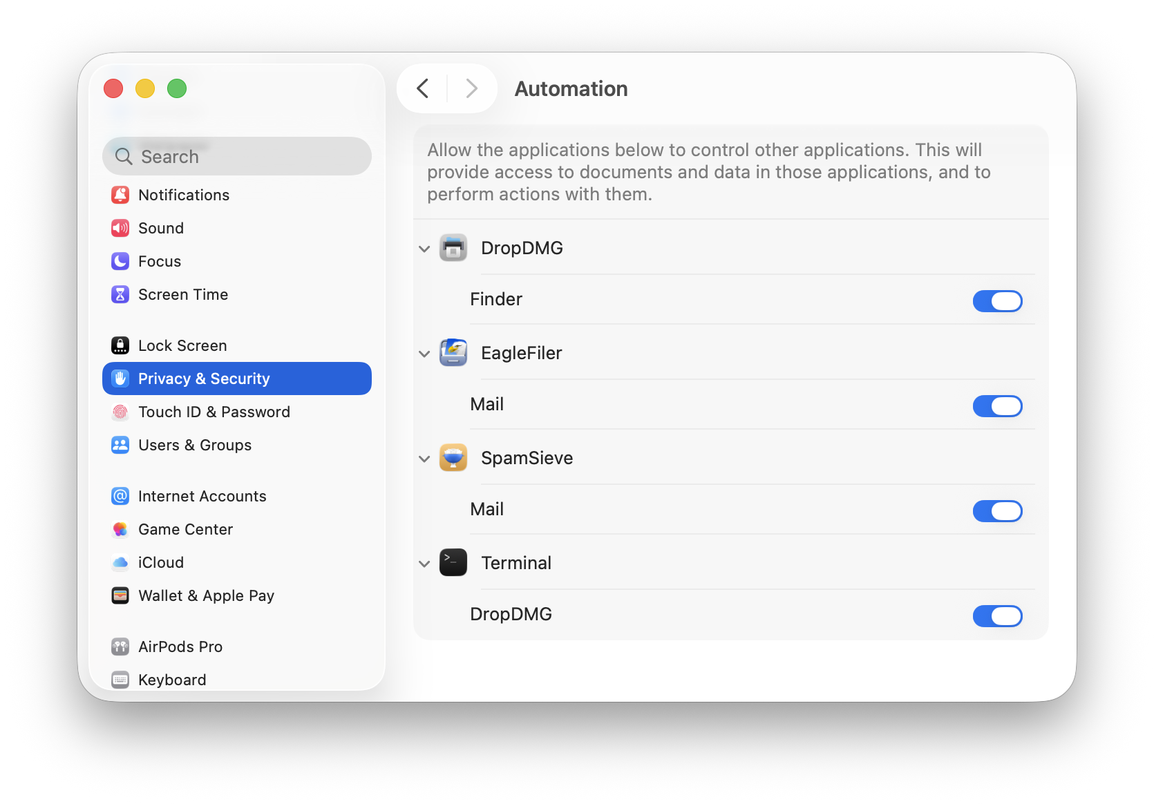
@BillyOK I’ve been retaking the screenshots for my apps (and their instructions that refer to System Settings, etc.), and it presents a question. If I just set things up normally for the screenshot, sometimes part of the window looks really bad, with unreadable text. To me, that ruins the shot in that even though it’s accurate it distracts and sometimes messes up what I’m trying to communicate. So I find that, instead of capturing au naturel, I’m making micro adjustments to make it look as good as possible (e.g. here I have made sure there’s no colored icon underneath the search field). I don’t know whether others are doing the same, but my guess is that if you look at screenshots that are not intended to critique Liquid Glass they are not a fair representation of what it’s like in actual use. (Also, if you take a window screenshot it often doesn’t capture how the window’s background actually looks…)
Just installed. The new “app launcher” Spotlight window is especially annoying. I have this ultra wide monitor and it looks ridiculously narrow. I instinctively keep trying to enlarge it but like System Settings width resizing is not allowed…
The left aligned text and image in alerts looks weird.
I installed it just to take a look at the horror show that everyone rants about. Well, to me anyway, it looks fine. There are quirks in spots, but overall quite usable. I think I could install this on my parents' computers and they would barely notice.
I'll throw this out there in case anyone else runs into this:
I was unable to get a network connection after updating to Tahoe. Settings displays my network status as "connected" but nothing was loading. Safari says "You are not connected to the internet". Turned on Personal Hotspot on my iPhone and tried to connect to that network instead. Still nothing.
All other devices connected to the same Wifi network were working as expected, so it wasn't that. Tried a restart. Nope.
So I did a quick Google search on my iPad and someone posted a comment in a Youtube video that said to turn on Firewall in System Settings. I didn't expect that to work... but it did.
@Objc4Life I had the same problem right after updating (to the GM, never with any of the betas). Instead of the firewall, I toggled Wi-Fi a few times, and eventually it worked.
I was surprised that nothing actually broke for me. I made sure to update all my apps using Latest before the upgrade.
The worst part by far is squircle jail. That was just unnecessary. Really hoping they fix that but I doubt it.
The second worst part is their justifications for it, which are all backwards talk doublespeak. It gets in the way, it doesn’t look that much better, doesn’t work better.
But not the worst thing they’ve ever done. They did actually fix a few small annoyances. Finder does actually look better and seems to work slightly better. Safari on Mac looks fine, but it’s awful on iOS.
I've been running all of the 26 developer betas since WWDC, and they've been fine. I actually thought the changes would be more drastic than they are. I don't understand why Apple would limit icons the way they have. What's the harm in having some little something protrude from the edge(s)? Let developers make icons look however they want to -- the "modern Internet" will come to our rescue and let them know if said icons suck.
Regarding wifi: I occasionally see a device drop off my wifi network. Sometimes turning the device's wifi off and on will get it back online. Sometimes I've had to "forget" that wifi network and then connect to it again.
@ObjC4Life the Trash Can is the most telling thing about their dumb icon idea. They seem to realize they couldn’t ruin that one because this whole concept is flawed and incompatible with the concept of the Trash Can icon.
Unfortunately I think it will be Trash Can that gets the bin before this poorly conceived icon scheme.
> They seem to realize they couldn’t ruin that one because this whole concept is flawed and incompatible with the concept of the Trash Can icon.
No doubt. Trash icon would look awful if confined to the rounded rectangle.
> I'm not sure if it's an preceptory illusion, but my M4 iMac actually feels faster after installing 26.
Interesting. Not the case for me. Things are quite slow and unresponsive for me. I just opened a new Safari window from the Safari app icon in the Dock. Nothing happened. I thought maybe I missed the click...maybe I clicked outside the menu item by mistake and didn't invoke the action? So I waited. The new Safari window popped up, I shit you not, like 30 seconds after I did the click.
Also Control Center toggle buttons like dark/light mode don't always respond to my clicks. Could just be my Mac but I seriously doubt it.
After every update, people report that OS X got much faster (maybe they haven't rebooted in a while) and much slower (maybe it's doing some setup in the background, or the update invalidated a bunch of caches). It's unlikely that there is a significant change in performance, other than the additional graphics rendering required for the stupid glass effects.
I upgraded yesterday. My thoughts so far:
It is okay. I do wish that Apple would have adoptable the iOS ability to specify a wallpaper for the lockscreen that is different from the user's wallpaper.
I was surprised to find that I do like the menu icons.
Tabs look horrible - at least on Safari and Finder.
I hate the menu icons. They’re too small to be legible so they just end up taking space. Plus not every menu item has an icon, which makes it awkwardly unbalanced
It just occurred to me, the menu icons are copied from Windows. They started doing the same dumb thing with Windows 11.
Microsoft, Apple, and Google just seem to copy each other's worst ideas lately.
If I recall correctly, menu icons in Microsoft products first became prominent around the Office 2000 timeframe:
https://edu.gcfglobal.org/en/office2000basics/menus/1/
Overall, I think they were better designed back then, compared with Apple's current attempt.
Also, it appears that the macOS 26 release build cannot be installed on the M3 Ultra Mac Studio: https://eclecticlight.co/2025/09/17/macos-26-0-tahoe-build-25a354-is-incompatible-with-mac-studio-m3-ultra/
Hey, we ran system extensions in System 7 or 8 that put icons in the menus! Don't blame Microsoft for this.
I had enough of the horror show that have been the Mac OS 26 betas to even remotely consider installing Tahoe on my production Mac (which is the only one that would support Tahoe, so I don't even have a spare Mac to use as a guinea pig).
The most recent Mac OS version I'm considering upgrading to is Sonoma. When Apple stops with the security updates, I'll take my chances. When everything become unusable, I'll just tinker with my vintage Macs, or maybe get a second-hand Mac recent enough to run the 'latest and shittiest' only because I have to stay somewhat up-to-date with the 'latest and shittiest' for work reasons. I already use Windows and Linux, and at least these platforms — while not perfect — have a certain degree of predictability that ultimately adds to their overall reliability.
Anyway, one thing is clear to me: with this UI direction, Apple does not respect Mac professionals and power users anymore — people who spend many hours using these machines and interacting with them. They think Mac users are like the plastic people we see in their commercials.
So I don't see why I should make my experience worse by installing this stuff.
@Hammer
> Every review I've read for macOS 26 shows 0 taste in UI and 100% cowardice:
They sound like those people who said "You mostly won't notice it" and "I don't really mind it" when the notch debuted on MacBooks. One of the most idiotic design choices I've seen on any computer.
@Riccardo Agreed with the notch (more awful design)!
I liked your recent posts, esp the awe dropping one that blew up on HN. It resonates a lot with me.
I'm sticking with Sequoia for production for a year and using Linux much more. Tahoe is on secondary Mac for checking user bug reports and providing user relief (where possible). I'm making a point *not* to upgrade to 26 on my other devices.
I'm not adopting Liquid Ass and I'm not filing bug reports (waste of my time). I don't get why so many Apple devs are fixated on chasing Apple down yet another broken path designed by 0-experience interns. SwiftUI is another broken path many Apple devs blindly ran down only to suffer. If you know something is garbage, it's a disservice to your users to adopt it.
I watched many devs waste many hours trying to get basic stuff in Tahoe working over the summer. I'm tired of the needless churn and having to pick up Apple's slack (on largely basic things) just to tread water or ship status-quo updates.
Tahoe is a moment of culmination where sustained platform neglect and developer abuse has really soured me on the Mac. I can find a crappy developer experience and amateur UI anywhere! Inertia is all that's holding me.
Well, upgraded to macOS 26, mostly because I don’t use it for work and how much could it hurt and I already have a foot out the door to Linux… big mistake. Already had to hard power off the machine multiple times when the entire UI froze completely. Similar experiences on iOS 26.