Icons in Menus Everywhere
I’ve never liked the philosophy of “put an icon in every menu item by default”.
[…]
This posture lends itself to a practice where designers have an attitude of “I need an icon to fill up this space” instead of an attitude of “Does the addition of a icon here, and the cognitive load of parsing and understanding it, help or hurt how someone would use this menu system?”
Apple currently says:
Don’t display an icon if you can’t find one that clearly represents the menu item. Not all menu items need an icon. Be careful when adding icons for custom menu items to avoid confusion with other existing actions, and don’t add icons just for the sake of ornamentation.
and in fact omits many icons in their apps. But I agree with Nielsen that there doesn’t seem to be a clear rationale for when they do this. It’s inconsistent and feels like they just didn’t finish the job or didn’t have suitable stock icons rather than that they actually considered and decided that certain commands shouldn’t have icons. It’s a mess.
Let’s look at the “File” menu in Safari[…] Some groupings have icons and get inset, while other groupings don’t have icons and don’t get inset.
[…]
Some of these menu items have the notion of a toggle (indicated by the checkmark) so now you’ve got all kinds of alignment things to deal with. The visual symbols are doubling-up when there’s a toggle and an icon.
[…]
You know what would be a fun game? Get a bunch of people in a room, show them menus where the textual labels are gone, and see who can get the most right.
Apple’s previous human interface guidelines specifically said not to use “arbitrary symbols in menus, because they add visual clutter and may confuse people.”
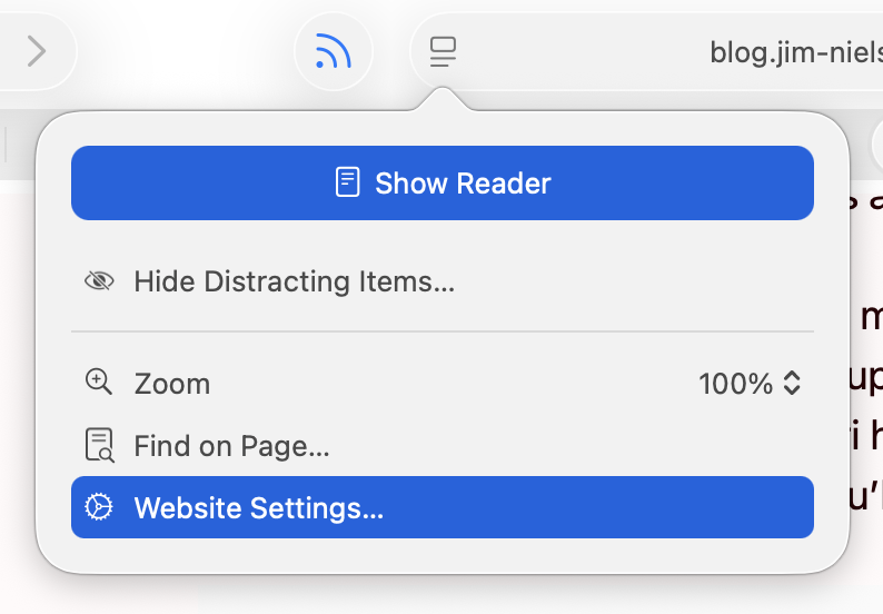
I am running 26.2, with a more complete set of icons in each menu, though not to the user’s benefit. For example, in Neilsen’s screenshot, the Safari menu has a gear icon beside the “Settings…” menu item, but not beside the “Settings for pxlnv.com…”, or whatever the current domain is. In 26.2, the latter has gained an icon — another gear. But it is a gear that is different from the “Settings…” menu item just above it, which makes sense, and also from the icon beside the “Website Settings…” menu item accessible from the menu in the address bar, which does not make sense because it does exactly the same thing.
On Tahoe, why is the image next to the save command in the File menu “square.and.arrow.down”, but the export and share commands are “square.and.arrow.up” and import has the arrow pointing down?
The arrow icons feel very iOS. I think the basic idea is that down means into the app and up means out of the app, but it doesn’t quite work for me because saving on the Mac can create a file anywhere. If there’s a command to save, that means it’s not going into the app’s own managed storage, like with saving a photo on iOS. And the difference with save vs. export is really the file format, not the location, so it doesn’t really make sense that the arrows would go in opposite directions.
Previously:
Apple 1992 vs 2025
I also think that the policy of placing icons in the menu is not good. First of all, currently the icons do not cover everything, there is information overload, things are easy to represent with pictograms but actions (commands) are abstract and difficult to iconize, etc.
If you want icons to work, they need to be consistent. […] How is Tahoe doing on that front? I present to you: Fifty Shades of “New”[…]
[…]
Conceptually, operations in a toolbar are identical to operations called through the menu, and thus should use the same icons [but Tahoe often doesn’t].
[…]
Another cardinal sin is to use the same icon for different actions.
[…]
Three dots occupying ⅔ of space vs three dots occupying everything. Seriously?
[…]
It’s not a lot of space to work with! Even Windows 95 had 16×16 icons.
[…]
But there’re downsides: fonts are hard to position vertically, their size doesn’t map directly to pixels, stroke width doesn’t map 1-to-1 to pixel grid, etc. So, they work everywhere, but they also look blurry and mediocre everywhere[…]
Finally someone else wonders why the icon for Select All looks like the button for creating a new text box.
It’s a brutal and well-deserved takedown.
My take is that the icon inconsistency is clearly iOS-inspired, where (virtually) all menu items have an associated icon, and seemingly stems from an apparent remand that all macOS menu items should also have icons for “consistency,” as if someone decided that consistency across operating systems was more important than decades of Macintosh user interface design—despite the current HIG explicitly stating “Not all menu items need an icon.”
Somehow I sort of tuned them out during last year’s rant about Liquid Glass, but they really do make a difference. I started actively noticing them in menus when my own little apps started sprouting some of them (apparently automatically) and thinking “why is that there?” or “what does that even mean?” and 90% of the time the icon is just not helping me at all, even in Apple’s own apps.
Set aside that I think it’s unnecessary and unattractive, it’s just implemented so poorly it makes me wonder how many resources Apple devoted to something this poorly done, and how many more resources it will have to devote to hopefully cleaning it up.
Exceptionally good article on UI design, using Tahoe’s regressions as examples of what not to do. Lots of side-by-side examples making the abstract obvious.
Devastating critique of the new menu icons in macOS Tahoe[…]
Tahoe’s redesign, perfectly summarized: self-inflicted problems, executed poorly, contradicting their own stated principles.
The slapdash result of this has “corporate mandate” written all over it. Like, maybe: everyone’s menu items must have icons before their code can merge. No one is following up to see if a good job was done because no one understands or believes in it, it’s just a box that must be checked on a compliance form.
The company culture must be so far gone for this to have happened. That’s what really concerns me. It’s really hard to come back from that.
This is a gallery of elementary problems. None of this should have shipped if someone with power internally had a critical eye for consistency and detail. If Apple deems it necessary to retain the icons, though I am not sure why it would, it should be treating this post as one giant bug report.
When these principles are violated, as they are regularly in Tahoe, users spend more time scanning menus and make more mistakes.
[…]
I’m not personally all that perturbed by Tahoe’s icons because I barely see them. I’m extremely text-focused, so I can’t help but read every word in my field of view, but small monochrome icons are merely background noise. Many of them mean nothing to me, so when I’m forced to use them, I just map a cluster of pixels to some action. That’s why I have trouble with toolbar- and palette-intensive interfaces in apps like Microsoft Word and Adobe Photoshop. When all the icons look basically the same to me, I have to rely on tooltips and relative placement to accomplish much of anything.
For many users—especially those with low vision—Tahoe’s menu icons increase visual search time and hurt recognition, directly undermining the HIG’s guidance.
It might sound hyperbolic but this change is the reason why I’ve decided not to upgrade to MacOS 26 Tahoe. I could put up with the rest of Liquid Glass’s half-baked who-thought-this-was-OK-to-ship? nonsense, but not the whole menu bar. I can tolerate being angry about UI changes Apple makes to the Mac. But I can’t tolerate being heartbroken.
There’s no defense for any of this. Don’t make the mistake of thinking Apple just needs better, more consistent icons. The fact that Tahoe’s menu item icons are glaringly inconsistent and often utterly inscrutable is the fudge icing on a shit cake, but the real embarrassment is that the idea ever got past the proposal stage. No real UI or icon designers think this is a good idea. None.
Y’all thought the menu icons in #macOSTahoe were bad on your shiny and crisp Retina display…?
Have you see them on a standard, 1x display?! They’re hella blurry and distorted af!!!
Menus are better with icons, end of story
when macOS 26 added menu item icons, i checked the HIG immediately.
it had two pieces of advice, one of which was: “not all menu items need an icon […] don’t add icons for the sake of ornamentation.”
but… i mean… then when do you… how do you decide? aren’t they all ornamentation? please, help us!
What’s old is new again. Also people loved these icons in Office 2000 but hated the adaptable/intelligent menus.
[…]
True story: the icons in menus came as part of a complete rewrite of the menus in Office 97--the first real release of “Office”, which already did not use the menu drawing code in Windows (or Mac, going back to the original Excel 2.x “layer”).
Architecturally the big thing was unifying all routing of commands to one place—whether it was a toolbar, a menu, a keyboard shortcut, or automation. THAT was super cool for us.
The random icons Apple littered about haphazardly made our menus uglier and less usable. Illustrative examples can be found in Audio Hijack and Farrago, which each contain “Import” and “Export” menu items. In Audio Hijack, Apple placed an icon on the “Export” option, but not on the “Import” option. Meanwhile in Farrago, neither item got an icon at all.
In addition to being inconsistent, Apple’s approach feels uncharacteristically heavy-handed. In the past, the company might have led by example in their own apps, while encouraging developers to follow along. But rather than WWDC sessions to educate and assist, they employed an overzealous tactic of running a search and replace on third-party apps, which has produced poor results.
[…]
Since the release of Tahoe, we’ve been stuck with the unattractive menus Apple has imposed upon us. Recently, however, we found we could do better. Thanks to inspiration from our old pal Brent Simmons, we can remove the clutter that’s been foisted upon our apps.
Our next releases will remove the icons Apple previously forced into our menus. This will restore clean, consistent, icon-free menus to our products.
I wish Apple had designed this with a setting so that users could enable or disable menu icons globally.
And the Oscar for Best Menu Title Alignment goes to … the Windows menu of the Stickies app!
What’s indeed fascinating here is that some of the titles are not just “not indented”, but are actually outdented, appearing further left than the icons above them.
Instead of using the same SF Symbol over and over for their Insert Chart menus, I feel like Apple could have just used the API introduced in macOS Sonoma which is to have section headers in menus:
NSMenuItem.sectionHeader(title: "")
8 Comments RSS · Twitter · Mastodon
Icons for menu items are a net negative and one of the many horrible "design" decisions in Liquid Ass.
They add nothing to just having the text, because with dozens of dumb little icons none of them really help to distinguish menu items.
And now there is pressure on all apps to add dumb useless icons to all items whether or not they help and they don't, and nobody not even Apple is up to it. So now in many apps you have an ugly inconsistent mess of menu items with icons and menu icons without icons all mixed together.
Maybe now with Dye's Ass almost out the door Apple will get rid of the stupid Liquid Ass menu icons and stupid rounded corners and stupid sidebar and toolbar changes, we should be so lucky, if only.
Nielsen's examples are good -- there are cases where an icon helps, but they are rare.
The way to build for 26 is to de-clutter menu icons and de-ass as much as possible. Fight Apple every step. They're wrong about LA (and many other things). Their recent dev newsletter proves they're still retarded about it.
Devs must drag Apple kicking and screaming into fixing the platform.
The biggest thing this highlights to me is how they just changed the rules. They used to be legendary for setting the gold standard of human interface guidelines.
And then in the last ten years or so when they started systematically violating them, no one put a stop to it and make them abide by the proven ideas, or at least take them into account.
The whole idea was supposed to be about human nature and the way the human mind and body work and adapting the computer system around that. Humans haven't changed.
But now it somehow seems to be more of a decorating guide than a human interface guide.
Used sparingly I think they are great. But I suspect that different people need icons for different sets of tasks. There are some I can never remember the keyboard shortcut for, and I've found myself scanning the right hand side of menus for keyboard shortcut "icons" to find them.
I hate the icons in Tahoe menus. They’re too small to be easily legible and they just clutter the menus up. The text was fine as it was
A lot of Apple’s “bad UI decisions” of late can also be explained by the need to make interfaces easier to localise. The goal is obviously to lower the amount of text across the board to the point at which a quick run of an AI translation tool will suffice — possibly even one built into Xcode.
Popular platforms already do this: take a look at Amazon’s app in France, for example — or, for that matter, their website. They speak a mixture of Canadian French and machine-generated nonsense. Nevertheless, it works well enough and nobody complains. Even Apple, whose translations always used to be impeccable — context-appropriate and culturally aware —, has started using machine translations in tucked-away corners of the Store.
Apple’s over-use of images and icons constitutes a safety net for bad translations. If your tool gleefully mixes “OK,” “Confirm,” and “Validate” in whatever language you are attempting to speak, users may get confused. Add an icon, and maybe it will be enough for people to “get it,” grumble, and get on with their day.
In parallel, of course, forcing the use of ready-made UI elements and controls grants Apple more power over localisation: they can hire one translator at the start of the chain and that person’s work will trickle down every OS-level component “for free,” making it easier for international developers to expand, which is not necessarily a hostile or malicious move on their part.
Oh, and let us not forget the rise of China in the list of Apple’s priorities, a country whose language uses ideograms, making it even harder to localise interfaces, due to the wildly different requirements in terms of spacing — and possibly user expectations in terms of layout and flow. The solution? Once again, icons.
I’ll go out on a limb and say that many of Apple’s “bad decisions” actually make perfect financial sense, provided one takes a slightly cynical look at them. Their “accessibility” push of a few years ago may have genuinely helped users with different needs, but it also conveniently helped usher in a lot of cost-cutting measures that, I fear, will become more obvious in the years to come. Apple takes a longer view than the punditry…
It's interesting the history behind this is not being discussed, or is just forgotten.
Historically apps had menus, and toolbars. Not every menu-item had a corresponding button on the toolbar, but every toolbar-button had an equivalent menu-item.
Then as part of the Windows 95 UI upgrades that came with IE5 the menu was changed such that an icon was displayed beside a menu-item if that menu-item had an associated toolbar button.
This did create a sort of rationale: if an item is very commonly used -- enough for it to be on a toolbar -- it had an icon in the menu. If it was rarely used, it did not.
Thus icons were used a visual indicators to most commonly used tasks.
Now of course things went immediately screwy with configurable toolbars in Office, which led to almost every menu-item having (optionally) a toolbar button and hence a menu-item icon too.
In modern Apple UI, in which there aren't really toolbars in the classic sense, the most obvious thing to do is to remove all menu-item icons, but I suspect the fear is that the resulting UI would be insufficiently pretty.
----
* i.e. the windows UI upgrade that came for free when you installed Internet Explorer 5
Colourful, contrasty and recognisable menu icons are great, but these tiny grey specks in Apple OS’s 26 are disappointing. Just look at LibreOffice’s menu icons (disabled by default) for an example of a more helpful approach.