Tim Hardwick (Hacker News):
The Tech Transparency Project, a non-profit advocacy group, flagged 52 apps in the App Store that had links to entities found on the Treasury Department’s list of Specially Designated Nationals (SDNs), a designation that prohibits U.S. companies from doing business with them.
Linked organisations included Russian financial institutions such as Gazprombank and National Standard Bank propping up Moscow’s invasion of Ukraine, and China’s Xinjiang Production and Construction Corps (XPCC), which has been sanctioned for involvement in repression of Uyghur minorities. Another app was run by a company owned by an accused Lithuanian drug trafficker.
The linked entities reportedly used name variants, shell developers, or partial references to obscure their sanctions status.
[…]
Legal experts say that [2019] agreement increases Apple’s exposure now, since the latest similar lapses suggest its promised improvements were insufficient. The findings also call into question Apple’s long-standing claim that its App Store provides a “safe and trusted” environment for users.
Given what gets through App Review, I’m sure you’re shocked that Apple’s sanctions status matching didn’t account for “spelling and capitalization variations” or “country-specific business suffixes.” Apple subsequently removed 35 of the apps but disputes that the others were in violation. The Google Play Store had 18 violations.
Previously:
App Review App Store App Store Scams iOS iOS 26 iOS App Legal Russia
Jim Nielsen (Hacker News):
I’ve never liked the philosophy of “put an icon in every menu item by default”.
[…]
This posture lends itself to a practice where designers have an attitude of “I need an icon to fill up this space” instead of an attitude of “Does the addition of a icon here, and the cognitive load of parsing and understanding it, help or hurt how someone would use this menu system?”
Apple currently says:
Don’t display an icon if you can’t find one that clearly represents the menu item. Not all menu items need an icon. Be careful when adding icons for custom menu items to avoid confusion with other existing actions, and don’t add icons just for the sake of ornamentation.
and in fact omits many icons in their apps. But I agree with Nielsen that there doesn’t seem to be a clear rationale for when they do this. It’s inconsistent and feels like they just didn’t finish the job or didn’t have suitable stock icons rather than that they actually considered and decided that certain commands shouldn’t have icons. It’s a mess.
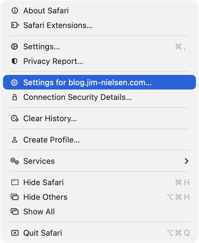
Let’s look at the “File” menu in Safari[…] Some groupings have icons and get inset, while other groupings don’t have icons and don’t get inset.
[…]
Some of these menu items have the notion of a toggle (indicated by the checkmark) so now you’ve got all kinds of alignment things to deal with. The visual symbols are doubling-up when there’s a toggle and an icon.
[…]
You know what would be a fun game? Get a bunch of people in a room, show them menus where the textual labels are gone, and see who can get the most right.
Apple’s previous human interface guidelines specifically said not to use “arbitrary symbols in menus, because they add visual clutter and may confuse people.”
Nick Heer:
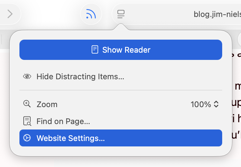
I am running 26.2, with a more complete set of icons in each menu, though not to the user’s benefit. For example, in Neilsen’s screenshot, the Safari menu has a gear icon beside the “Settings…” menu item, but not beside the “Settings for pxlnv.com…”, or whatever the current domain is. In 26.2, the latter has gained an icon — another gear. But it is a gear that is different from the “Settings…” menu item just above it, which makes sense, and also from the icon beside the “Website Settings…” menu item accessible from the menu in the address bar, which does not make sense because it does exactly the same thing.
James Thomson:
On Tahoe, why is the image next to the save command in the File menu “square.and.arrow.down”, but the export and share commands are “square.and.arrow.up” and import has the arrow pointing down?
The arrow icons feel very iOS. I think the basic idea is that down means into the app and up means out of the app, but it doesn’t quite work for me because saving on the Mac can create a file anywhere. If there’s a command to save, that means it’s not going into the app’s own managed storage, like with saving a photo on iOS. And the difference with save vs. export is really the file format, not the location, so it doesn’t really make sense that the arrows would go in opposite directions.
Previously:
Apple 1992 vs 2025
I also think that the policy of placing icons in the menu is not good. First of all, currently the icons do not cover everything, there is information overload, things are easy to represent with pictograms but actions (commands) are abstract and difficult to iconize, etc.
If you want icons to work, they need to be consistent. […] How is Tahoe doing on that front? I present to you: Fifty Shades of “New”[…]
[…]
Conceptually, operations in a toolbar are identical to operations called through the menu, and thus should use the same icons [but Tahoe often doesn’t].
[…]
Another cardinal sin is to use the same icon for different actions.
[…]
Three dots occupying ⅔ of space vs three dots occupying everything. Seriously?
[…]
It’s not a lot of space to work with! Even Windows 95 had 16×16 icons.
[…]
But there’re downsides: fonts are hard to position vertically, their size doesn’t map directly to pixels, stroke width doesn’t map 1-to-1 to pixel grid, etc. So, they work everywhere, but they also look blurry and mediocre everywhere[…]
Finally someone else wonders why the icon for Select All looks like the button for creating a new text box.
It’s a brutal and well-deserved takedown.
My take is that the icon inconsistency is clearly iOS-inspired, where (virtually) all menu items have an associated icon, and seemingly stems from an apparent remand that all macOS menu items should also have icons for “consistency,” as if someone decided that consistency across operating systems was more important than decades of Macintosh user interface design—despite the current HIG explicitly stating “Not all menu items need an icon.”
Rui Carmo:
Somehow I sort of tuned them out during last year’s rant about Liquid Glass, but they really do make a difference. I started actively noticing them in menus when my own little apps started sprouting some of them (apparently automatically) and thinking “why is that there?” or “what does that even mean?” and 90% of the time the icon is just not helping me at all, even in Apple’s own apps.
Warner Crocker:
Set aside that I think it’s unnecessary and unattractive, it’s just implemented so poorly it makes me wonder how many resources Apple devoted to something this poorly done, and how many more resources it will have to devote to hopefully cleaning it up.
Exceptionally good article on UI design, using Tahoe’s regressions as examples of what not to do. Lots of side-by-side examples making the abstract obvious.
Simon Willison:
Devastating critique of the new menu icons in macOS Tahoe[…]
Marco Arment:
Tahoe’s redesign, perfectly summarized: self-inflicted problems, executed poorly, contradicting their own stated principles.
David Deller:
The slapdash result of this has “corporate mandate” written all over it. Like, maybe: everyone’s menu items must have icons before their code can merge. No one is following up to see if a good job was done because no one understands or believes in it, it’s just a box that must be checked on a compliance form.
The company culture must be so far gone for this to have happened. That’s what really concerns me. It’s really hard to come back from that.
Nick Heer:
This is a gallery of elementary problems. None of this should have shipped if someone with power internally had a critical eye for consistency and detail. If Apple deems it necessary to retain the icons, though I am not sure why it would, it should be treating this post as one giant bug report.
Adam Engst:
When these principles are violated, as they are regularly in Tahoe, users spend more time scanning menus and make more mistakes.
[…]
I’m not personally all that perturbed by Tahoe’s icons because I barely see them. I’m extremely text-focused, so I can’t help but read every word in my field of view, but small monochrome icons are merely background noise. Many of them mean nothing to me, so when I’m forced to use them, I just map a cluster of pixels to some action. That’s why I have trouble with toolbar- and palette-intensive interfaces in apps like Microsoft Word and Adobe Photoshop. When all the icons look basically the same to me, I have to rely on tooltips and relative placement to accomplish much of anything.
For many users—especially those with low vision—Tahoe’s menu icons increase visual search time and hurt recognition, directly undermining the HIG’s guidance.
John Gruber (Mastodon):
It might sound hyperbolic but this change is the reason why I’ve decided not to upgrade to MacOS 26 Tahoe. I could put up with the rest of Liquid Glass’s half-baked who-thought-this-was-OK-to-ship? nonsense, but not the whole menu bar. I can tolerate being angry about UI changes Apple makes to the Mac. But I can’t tolerate being heartbroken.
John Gruber (Mastodon):
There’s no defense for any of this. Don’t make the mistake of thinking Apple just needs better, more consistent icons. The fact that Tahoe’s menu item icons are glaringly inconsistent and often utterly inscrutable is the fudge icing on a shit cake, but the real embarrassment is that the idea ever got past the proposal stage. No real UI or icon designers think this is a good idea. None.
Mario Guzmán:
Y’all thought the menu icons in #macOSTahoe were bad on your shiny and crisp Retina display…?
Have you see them on a standard, 1x display?! They’re hella blurry and distorted af!!!
Steve Troughton-Smith:
Menus are better with icons, end of story
Cabel Sasser:
when macOS 26 added menu item icons, i checked the HIG immediately.
it had two pieces of advice, one of which was: “not all menu items need an icon […] don’t add icons for the sake of ornamentation.”
but… i mean… then when do you… how do you decide? aren’t they all ornamentation? please, help us!
Steven Sinofsky:
What’s old is new again. Also people loved these icons in Office 2000 but hated the adaptable/intelligent menus.
[…]
True story: the icons in menus came as part of a complete rewrite of the menus in Office 97--the first real release of “Office”, which already did not use the menu drawing code in Windows (or Mac, going back to the original Excel 2.x “layer”).
Architecturally the big thing was unifying all routing of commands to one place—whether it was a toolbar, a menu, a keyboard shortcut, or automation. THAT was super cool for us.
The random icons Apple littered about haphazardly made our menus uglier and less usable. Illustrative examples can be found in Audio Hijack and Farrago, which each contain “Import” and “Export” menu items. In Audio Hijack, Apple placed an icon on the “Export” option, but not on the “Import” option. Meanwhile in Farrago, neither item got an icon at all.
In addition to being inconsistent, Apple’s approach feels uncharacteristically heavy-handed. In the past, the company might have led by example in their own apps, while encouraging developers to follow along. But rather than WWDC sessions to educate and assist, they employed an overzealous tactic of running a search and replace on third-party apps, which has produced poor results.
[…]
Since the release of Tahoe, we’ve been stuck with the unattractive menus Apple has imposed upon us. Recently, however, we found we could do better. Thanks to inspiration from our old pal Brent Simmons, we can remove the clutter that’s been foisted upon our apps.
Our next releases will remove the icons Apple previously forced into our menus. This will restore clean, consistent, icon-free menus to our products.
I wish Apple had designed this with a setting so that users could enable or disable menu icons globally.
And the Oscar for Best Menu Title Alignment goes to … the Windows menu of the Stickies app!
What’s indeed fascinating here is that some of the titles are not just “not indented”, but are actually outdented, appearing further left than the icons above them.
Instead of using the same SF Symbol over and over for their Insert Chart menus, I feel like Apple could have just used the API introduced in macOS Sonoma which is to have section headers in menus: NSMenuItem.sectionHeader(title: "")
Design Finder Google Sheets Icons Liquid Glass Mac macOS Tahoe 26 Safari Stickies
Wade Tregaskis:
Given how buggy Apple’s screen saver framework is, I suggest not relying on animateOneFrame if you can at all avoid it. Even if that means setting up your own timer. That way when they likely break that too in some future macOS release, your screen saver won’t necessarily break as well.
[…]
stopAnimation is only used for the live preview thumbnail shown in the Screen Saver System Settings pane. It is never called in normal operation of the screen saver (contrary to what Apple’s documentation says – Apple broke that in macOS Sonoma and later).
[…]
Here’s the second big bug in Apple’s screen saver framework – every time the screen saver starts, your ScreenSaverView subclass is created again. But the old one doesn’t go anywhere. So now you have two copies running simultaneously, which as at the very least wasteful, and can easily lead to gnarly bugs and weird behaviour (e.g. if both are playing sound, or both modify persistent state).
[…]
Unfortunately Apple’s screen saver system will never terminate your screen saver process. Worse, even if you do nothing yourself, Apple’s screen saver framework code will run in an infinite loop, wasting [a small amount of] CPU time.
There was a longstanding API that worked fine for many years but then got progressively more broken.
Update (2025-12-11): James Miller:
Same experience years ago making a recreation of the After Dark Flying Toaster screensaver. It was such a strange development process…
Kevin Boyd:
I tried writing one a few years ago and got stymied by everything being terrible & no information being available. Maybe I can get back into it soon.
Bug Core Animation Mac macOS Tahoe 26 Programming Screensaver Swift Programming Language
Rebecca Bellan:
The New York Times filed suit Friday against AI search startup Perplexity for copyright infringement, its second lawsuit against an AI company. The Times joins several media outlets suing Perplexity, including the Chicago Tribune, which also filed suit this week.
The Times’ suit claims that “Perplexity provides commercial products to its own users that substitute” for the outlet, “without permission or remuneration.”
[…]
Perplexity tried to address compensation demands by launching a Publishers’ Program last year, which offers participating outlets like Gannett, TIME, Fortune and the Los Angeles Times a share of ad revenue. In August, Perplexity also launched Comet Plus, allocating 80% of its $5 monthly fee to participating publishers, and recently struck a multi-year licensing deal with Getty Images.
Emma Roth:
Perplexity became the subject of several lawsuits after reporting from Forbes and Wired revealed that the startup had been skirting websites’ paywalls to provide AI-generated summaries — and in some cases, copies — of their work. The NYT makes similar accusations in its lawsuit, stating that Perplexity’s crawlers “have intentionally ignored or evaded technical content protection measures,” such as the robots.txt file, which indicates the parts of a website crawlers can access.
[…]
The NYT is seeking damages and is also asking the court to permanently block the AI startup from engaging in its allegedly unlawful behavior.
Perplexity’s spokesperson didn’t seem to deny the allegations.
Previously:
Artificial Intelligence Business Copyright Lawsuit Legal Perplexity The New York Times Web Web Crawlers