How to Turn Liquid Glass Into a Solid Interface
Apple’s new Liquid Glass interface design brings transparency and blur effects to all Apple operating systems, but many users find it distracting or difficult to read. Here’s how to control its effects and make your interface more usable. Although the relevant Accessibility settings are quite similar across macOS, iOS, watchOS, and tvOS, I separate them because they offer different levels of utility in each.
[…]
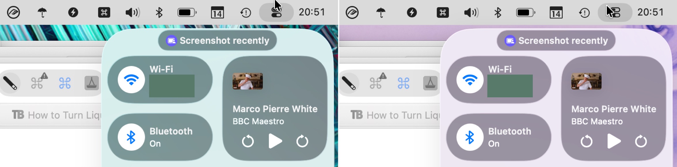
For those who take a lot of screenshots, like I do, Reduce Transparency is essential because it ensures that all screenshots have a consistent background. It would be highly distracting if screenshots had noticeably different colors due to being taken over different wallpapers or windows.
[…]
I find the Increase Contrast setting jarring, but it might be a significant help for those with low vision.
[…]
I can’t recommend turning off Liquid Glass entirely in this way. Although it does make macOS 26 look more like macOS 15, it suffers from several glaring mistakes that Apple has no incentive to fix. Stick to Reduce Transparency and add Increase Contrast if your eyes would appreciate it.
There are lots of good comparison screenshots.
A useful guide for today — and, I bet, a useful look back at the first versions of Liquid Glass for the future.
A notable issue with these settings is that some properties of Liquid Glass are not truly the fault of transparency. Instead, a Liquid Glass element — like Control Centre — might be reflecting the colours around it, giving the impression of translucency without actually being translucent. This effect does not appear in window-specific screenshots when you have “Reduce Transparency” turned on so, as Engst writes, it makes it better for creating screenshots for documentation. But it does mean that, while the “Reduce Transparency” setting is literally true, it feels dishonest.
Don’t forget you can override and set Reduce Transparency on a per-app basis[…]
If you think that turning on Reduce Transparency will fix all the problems with Liquid Glass, you’re wrong.
Here’s a standard bar button item drawn with reduced transparency. It goes from being dark (the system setting) to light the first time you use it.
This still has no effect on controls below the toolbar, and fails to demarcate text entry fields or the list view below.
Ewww. When you enable reduce transparency in iOS accessibility settings, certain things are just so bad. Look how the back button touches the background border at the bottom now.
Sigh.
Apple really said “you don’t get world out class design if you enable any of the accessibility options.”
It’s almost comical if you think about Apple marketing Liquid Glass to bring “more focus to content” and switch between [on] and [off].
The later one shows more content or the same content bigger in almost all parts of the screen: Look at the calendar in the top left (even the iCal icon shows the more useful “Wed” instead of “Oct”) or the sidebar.
Event the main content gets a few pixels extra space – obscured content behind the sidebar does not count IMHO.
Previously:
- On Liquid Glass
- Liquid Glass: Content vs. Controls
- Liquid Glass Is Cracked
- Shipping Liquid Glass
- macOS Tahoe 26
- Assorted Notes on Liquid Glass
Update (2025-10-20): Pierre Igot:
No matter which version of this I am looking at (with or without reduced transparency, with or without increased contrast), I just don’t understand how, intuitively, I am supposed to understand that clicking on any of the three buttons in the top-right corner of the sidebar is going to affect not just the sidebar, but the whole window that the sidebar is a small subsection of.
Update (2025-11-26): Glenn Fleishman:
I originally found Liquid Glass almost offensively illegible and shiny. I thought I’d never get used to it. But Apple refined the interface through what must have been an enormous amount of feedback, with the release version—particularly in Tahoe—dialing down and working around some of the worst interactions.
However, there’s still a lot of room for improvement, where type overlaps images or translucent fields or buttons are too see-through to see easily.
9 Comments RSS · Twitter · Mastodon
Mac articles turned from "cool things you can do with your Mac" to "how to mitigate Apple's disaster". The tone is far too apologetic.
Call Liquid Ass "complete crap" and start pushing for a revert to macOS Lion's UI or something.
To be fair not every idea in the design is complete garbage. At least buttons do look like buttons, toggled states are obvious.
They just can't do this on the artbitrary release schedule they've set. And also with too few executives with too few ideas in charge of too many projects.
The issue really does seem centered around the fact that Cook, Dye, CFed, Cue, Schiller, and Joz are basically this out of touch core filter everything has to pass through, and they all seem distracted with pointless things while missing or purposely ignoring the most obvious problems.
If they reveal the emperor has no clothes, they’d lose access to the courtyard, where they get to brown nose for access.
Everyone I know that has updated is unhappy. And I’m not talking about nerds who obsess over these operating systems. Normal people that just find it ugly or broken or buggy or a combination of these.
Instead, virtually all of Apple media is “agnostic” about it, “indifferent” about it, but certainly not antagonistic about it. “Yes, there are some bugs, but it’s not that bad” while making clickbait on “meanwhile, check these articles on how to disable all the shit and get an even worse experience” mundane nonsense.
Color me indifferent, if needed.
I've always updated my macOS only when needed, which is when Xcode requires it. Still hoping that is in the March-May timeframe next year.
I did update iOS and for the *few* app I use.... weather (3rd party), podcasts (3rd party), Messages (jury still out), Phone (buggy but only in certain cases).... it's.... okay. A bit too bouncy.
iPad? only use it sparingly for games.
Development. Still working on my iOS app updates.
I get the near total negativity and how painful this next year will be. But for many users I can see things are.... okay?
Light mode is too light, and dark mode is extremely bland. We really had it all with the 10.9 Aqua - light, but with enough contrast and better/softer lighting, color throughout, and photorealistic icons and effects. No ridiculous felt and leather textures. The best they've ever done.
Co-signing what @Ben said. Mavericks really was the height of design for me — pulled back on some of Lion’s overindulgences, had that lovely dock, pretty icons, solid consistent design language (for the most part), pleasant to use. And it refined notifications to show *more* actions on the banner instead of less! What a concept.
@bart "At least buttons do look like buttons"
It's an improvement over Big Sur and most of what happened to iOS in the last 12 years, for sure, but that's still not quite true. Buttons are merely sometimes presented in a glass bubble that looks like a button. This doesn't fix the cases when they're not in bubbles (i.e. nearly every button that's not in a toolbar), and introduces a number of new problems, like disabled buttons providing visual feedback when clicked, sometimes more vividly than enabled buttons. There's also a new HIG rule that textual and icon buttons in toolbars must never be placed in the same group, or else it looks like a single button with an icon.