Adam Engst (Hacker News):
Apple’s new Liquid Glass interface design brings transparency and blur effects to all Apple operating systems, but many users find it distracting or difficult to read. Here’s how to control its effects and make your interface more usable. Although the relevant Accessibility settings are quite similar across macOS, iOS, watchOS, and tvOS, I separate them because they offer different levels of utility in each.
[…]
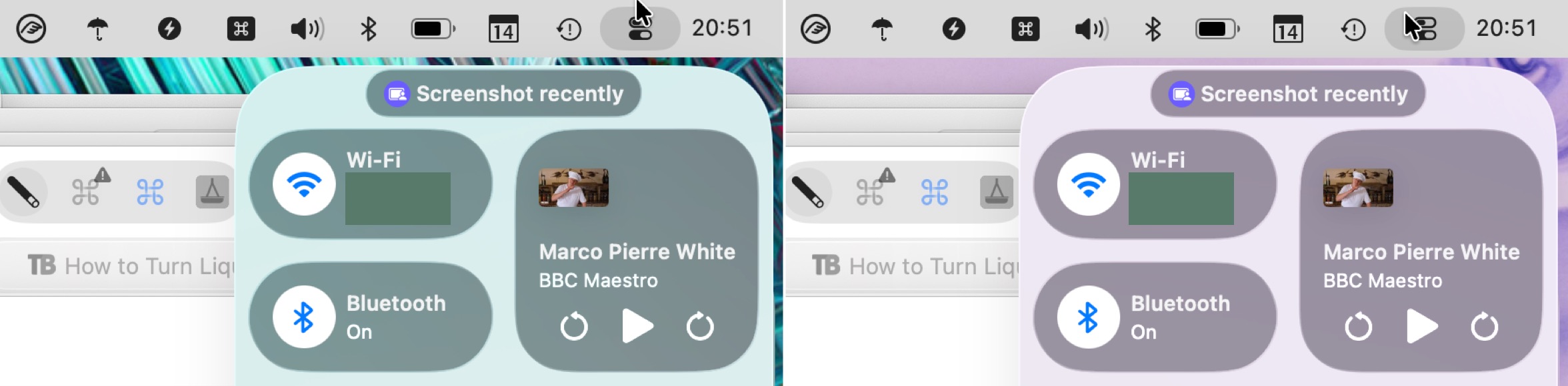
For those who take a lot of screenshots, like I do, Reduce Transparency is essential because it ensures that all screenshots have a consistent background. It would be highly distracting if screenshots had noticeably different colors due to being taken over different wallpapers or windows.
[…]
I find the Increase Contrast setting jarring, but it might be a significant help for those with low vision.
[…]
I can’t recommend turning off Liquid Glass entirely in this way. Although it does make macOS 26 look more like macOS 15, it suffers from several glaring mistakes that Apple has no incentive to fix. Stick to Reduce Transparency and add Increase Contrast if your eyes would appreciate it.
There are lots of good comparison screenshots.
John Gruber:
A useful guide for today — and, I bet, a useful look back at the first versions of Liquid Glass for the future.
Nick Heer:
A notable issue with these settings is that some properties of Liquid Glass are not truly the fault of transparency. Instead, a Liquid Glass element — like Control Centre — might be reflecting the colours around it, giving the impression of translucency without actually being translucent. This effect does not appear in window-specific screenshots when you have “Reduce Transparency” turned on so, as Engst writes, it makes it better for creating screenshots for documentation. But it does mean that, while the “Reduce Transparency” setting is literally true, it feels dishonest.
Rosyna Keller:
Don’t forget you can override and set Reduce Transparency on a per-app basis[…]
Craig Hockenberry:
If you think that turning on Reduce Transparency will fix all the problems with Liquid Glass, you’re wrong.
Here’s a standard bar button item drawn with reduced transparency. It goes from being dark (the system setting) to light the first time you use it.
Howard Oakley:
This still has no effect on controls below the toolbar, and fails to demarcate text entry fields or the list view below.
Mario Guzmán:
Ewww. When you enable reduce transparency in iOS accessibility settings, certain things are just so bad. Look how the back button touches the background border at the bottom now.
Sigh.
Apple really said “you don’t get world out class design if you enable any of the accessibility options.”
Der Teilweise:
It’s almost comical if you think about Apple marketing Liquid Glass to bring “more focus to content” and switch between [on] and [off].
The later one shows more content or the same content bigger in almost all parts of the screen: Look at the calendar in the top left (even the iCal icon shows the more useful “Wed” instead of “Oct”) or the sidebar.
Event the main content gets a few pixels extra space – obscured content behind the sidebar does not count IMHO.
Previously:
Update (2025-10-20): Pierre Igot:
No matter which version of this I am looking at (with or without reduced transparency, with or without increased contrast), I just don’t understand how, intuitively, I am supposed to understand that clicking on any of the three buttons in the top-right corner of the sidebar is going to affect not just the sidebar, but the whole window that the sidebar is a small subsection of.
Update (2025-11-26): Glenn Fleishman:
I originally found Liquid Glass almost offensively illegible and shiny. I thought I’d never get used to it. But Apple refined the interface through what must have been an enormous amount of feedback, with the release version—particularly in Tahoe—dialing down and working around some of the worst interactions.
However, there’s still a lot of room for improvement, where type overlaps images or translucent fields or buttons are too see-through to see easily.
Accessibility Design iOS iOS 26 Liquid Glass Mac macOS Tahoe 26 Screenshots
Raluca Budiu (Hacker News):
One of the oldest findings in usability is that anything placed on top of something else becomes harder to see. Yet here we are, in 2025, with Apple proudly obscuring text, icons, and controls by making them transparent and placing them on top of busy backgrounds.
[…]
And then comes Apple’s boldest (or dumbest) experiment: text on top of text.
[…]
In iOS 26, controls insist on animating themselves, whether or not the user benefits. Carousel dots quietly morph into the word Search after a few seconds. Camera buttons jerk slightly when tapped. Tab bars bubble and wiggle when switching views, and buttons briefly pulsate before being replaced with something else entirely. It’s like the interface is shouting “look at me” when it should quietly step aside and let the real star — the content — take the spotlight.
[…]
Apple has also decided it’s time to crowd and shrink touch targets. The long‑standing guideline of at least 0.4cm between targets (and 1cm × 1cm tap areas) seems to have been tossed out the window. Either Apple believes our fingers are getting smaller, or it assumes years of practice with smartphones have magically trained us to hit tiny targets with perfect precision.
[…]
This signals another transition (this time for the worse) to Android-style design, where page titles are left-aligned (instead of center-aligned), thus displacing the breadcrumb next to the back button.
Nick Heer:
However, I found the argument against the more prominent Search button in many apps unconvincing[…]
Me, too. I don’t like that it floats on top of content, but I think people did have trouble discovering it when you had to swipe down. Maybe the placement at the bottom also makes it easier to tap.
What is disappointing is that the hidden search field still exists in a handful of places. Most notably, Music on iOS 26 still has two different kinds of Search: the one you can get to by tapping on the button in the bottom-right, and the locally-scoped one you will find at the top of views like Playlists.
Previously:
Design iOS iOS 26 Liquid Glass Music.app Search
Adam Engst:
Here’s where I take exception to Liquid Glass, and to Apple’s positioning of content as the most important aspect of our digital devices, and thus of our digital lives. Yes, many people are largely passive consumers of content, whether we’re talking about Web pages, podcasts, or streaming videos. For those people, there is little beyond content, and Liquid Glass’s deprecation of controls may allow them to continue their consumption with less distraction. But that’s not a lifestyle to aspire to, reminiscent as it is of the humans in WALL-E—perpetually reclined in floating chairs, mindlessly consuming entertainment.
[…]
But there’s an important point to make here: controls are not tools. Controls allow you to adjust settings—change channels, select colors, pause playback, and more. Tools enable you to create, modify, delete, or give a performance. It’s the difference between a volume knob and a violin.
[…]
So, no, I don’t want tools that “give way to content” or “shrink to bring focus to the content.” When I’m cooking, I want my knives, spatulas, measuring spoons, and the like exactly where they belong, so they’re instantly at hand.
Nick Heer:
Engst pointedly differentiates “productivity apps — real tools” from apps permitting a more passive consumption of media. It may make more sense for controls to fade away in something like a media player. In most of the apps I use every day, however, I want to have obvious and immediate access to the tools I need.
Here is another cooking analogy: a minimum requirement, for me, for a stove is for it to be equipped with physical knobs. I do not want to be hunting for the magic capacitive spot or pressing a +/– toggle to change a burner’s setting. The latter options seem more elegant; they give the impression of refinement. But they are less effective for the same job because they do not allow for real-world practicality.
Nick Heer:
Apple justifies these decisions by saying its redesigned interfaces are “bringing greater focus to content”. I do not accept that explanation. Instead of placing tools in a distinct and separated area, they bleed into your document, thus gaining a similar level of importance as the document itself. I have nothing beyond my own experience to back this up. Perhaps Apple has user studies suggesting something different; if it does, I think it should publicly document its research. But, in my experience, the more the interface blends with what I am looking at, the less capable I am of ignoring it. Clarity and structure are sacrificed for the illusion of simplicity offered by a monochromatic haze of an interface.
Jeff Johnson (Mastodon):
A customer recently contacted me to report that the “Show native video controls” feature makes videos darker on macOS Tahoe, and I was able to reproduce the issue myself. At first I believed that the phenomenon was some kind of Liquid Glass nonsense, because I couldn’t reproduce it on macOS Sequoia. On further testing, however, I noticed that the darkening of videos also occurs on iOS 18, which my iPhone still runs (for as long as I can hold out). Indeed, the darkening of videos has nothing in particular to do with StopTheMadness Pro and occurs even when the extension is disabled entirely. Safari itself darkens videos on iOS 18, iOS 26, and now macOS 26 when its native video controls are displayed.
[…]
Seriously, why??? I thought Liquid Glass was supposed to “bring greater focus to content”? Darkening videos brings less focus to content!
Previously:
Update (2025-10-21): Colin Cornaby:
If seeing content is so important I don’t know why Apple insists on adding corners to it. (This is the system video miniplayer which has no reason to have any rounded corners at all.)
Update (2025-11-12): Jeff Johnson:
A couple of months ago I blogged about how Safari darkens videos on macOS Tahoe. I’ve now discovered how to disable this change! For better or worse, Safari does not appear to allow CSS styling of its native video controls, so the custom CSS feature of my Safari extension StopTheMadness Pro is of no help here. However, it turns out that Safari has a built-in flag that you can disable in its hidden Debug menu.
[…]
The flag you’re looking for is called “Hosted blur material in media controls” in the “WebKit Internal Features” submenu of the Safari Debug menu.
Design iOS iOS 26 Liquid Glass Mac macOS Tahoe 26 Safari Video
Mario Guzmán:
I can’t stop laughing at how comically large the corner radii are on #macOSTahoe windows. Clownish.
Dominik Wagner:
Preview? These are white, A4 PDF pages, they don’t have round corners. We are not on battlestar galactica. I need my pdf preview to show me my paper as it is, not with different rounded corners based on my zoom factor 😡
Marcin Krzyzanowski:
after I upgraded to macOS26 literally the only thing that annoys me the most is hikarious windows curvature. no content really fits in.
Rui Carmo:
I can see four five different sizes of window corner radius on my Mac desktop. The overall visual design for menus and dialogs is still a joke, and is so badly executed that Apple should be ashamed of shipping it.
See also: Rob Jonson.
Nick Heer:
Perhaps I am taking this too literally. Then again, Apple is the one saying application windows are no longer “configured for rectangular displays”, and that they now fit the “rounded corners of modern hardware”. Regardless of the justification, I quite like the roundness of these windows. Perhaps it is simply the newness, but they make applications seem friendlier and softer. I understand why they are controversial; the large radius severely restricts what can be present in the corners, thus lowering the information density of an application window. It seems Apple agrees it is more appropriate in some apps than in others — app windows in System Information and Terminal have a much smaller corner radius.
[…]
Even on a device with four rounded display corners, this dedication to concentricity is not always executed correctly. My iPhone 15 Pro, for example, has corners with a slightly smaller radius than an iPhone 16 Pro. The bottom corners of the share sheet on my device are cramped, nearly touching the edge of the display at their apex.
[…]
Then there are the issues caused by this dedication to concentricity. Look again at that Finder window screenshot above and pay attention to the buttons in the toolbar. In particular, notice how the icon in the item grouping button — the solitary one between the view switcher, and the group that includes the sharing button — looks like it is touching the rounded edge.
Previously:
Update (2025-11-12): John Gruber:
But my main MacBook Pro is still running MacOS 15 Sequoia — not because of any compatibility issues, but simply because I think the Tahoe user interface is goofy looking. I’ll probably bite the bullet and upgrade when 26.2 comes out next month, but for now, I’m luxuriating with a MacOS UI with well-crafted app icons and windows that don’t have Fisher-Price-style corner radiuses.
Design Finder Liquid Glass Mac macOS Tahoe 26 Preview.app
Nick Heer (Mastodon):
I do not think all these effects necessarily help legibility, which is as poor as it has ever been in translucent areas. The degree to which this is noticeable is dependent on the platform. In iOS 26, I find it less distracting, I think largely because it exists in the context of a single window at a time (picture-in-picture video being the sole exception). That means there is no expectation of overlapping active and inactive windows and, so, no chance that something overlapping within a window’s area could be confused with a different window overlapping.
[…]
Though these animations are not nearly as fluid as they were first shown, they seem like they help justify the “liquid” part of the name, and are something Apple has enough pride in to be called out in the press release. Their almost complete absence on MacOS is therefore notable. There are a handful of places they appear, like in Spotlight, but MacOS feels less committed to Liquid Glass as a result. When menus are summoned, they simply appear without any dramatic animation. Buttons and menus do not have the stretchy behaviour of their iOS counterparts. To be sure, I am confident those animations in MacOS would become tiresome in a matter of minutes. But, so, if MacOS is better for being less consistent with iOS in this regard, that seems to me like a good argument against forcing cross-platform user interface unification.
[…]
I am spending an awful lot of words on the MacOS version because I think it is the least successful of the two Liquid Glass implementations I have used. MacOS still works a lot like MacOS. But it looks and feels like someone dictated, context-free, that it needed to reflect the redesign of iOS.
[…]
I kept asking myself “why?” as I used iOS 26 and MacOS 26 this summer. I wanted to understand the rationale for a complete makeover across Apple’s entire line of products. What was the imperative for unifying the systems’ visual interface design language? Why this, specifically?
[…]
These new operating systems do not feel like they are achieving that level of consistency despite being nominally more consistent across a half-dozen platforms. MacOS has received perhaps the most substantial visual changes, yet it is full of workarounds and exceptions. The changes made to iOS feel surface-level and clash with the visual language established since iOS 7. I am hopeful for the evolution of these ideas into something more cohesive. Most software is a work-in-progress, and the user interface is no exception. But all I can reflect upon is what is before me today. Quite simply, not only is it not ready, I am concerned about what it implies about Apple’s standards.
Eric Schwarz:
This is one of those posts that I recommend taking some time (perhaps cozy up with a coffee?) and simply enjoying the thoughtful analysis provided.
[…]
I’ve upgraded all of my devices, with the sole exception being my Mac at work. I’ll get around to it, but waiting for a lull. For the most part, everything works about the same and there isn’t a jarring change from when I’m at my desk at work and my desk at home. Contrast that with someone adapting from Windows 10 to Windows 11 across devices, as many interface elements work differently. Yes, there are visually differences between macOS 15 and macOS 26, and I think the changes to macOS 26 are my least favorite of all the updates. I’ve grown to actually enjoy the iOS/iPadOS 26 changes, especially the added depth in icons and buttons and little animations to make the entire operating system feel more fluid—it’s interesting and a bit of a shift away from the minimalism trend that we’ve had over the past decade and change.
Adam Engst:
I highly recommend reading Heer’s extensively documented criticisms of Liquid Glass. He offers numerous examples of what he likes and doesn’t like about Liquid Glass, though there is much more of the latter, leading to this delicious line, “I could keep going with my nitpicks, so I shall.” Nevertheless, it’s essential to acknowledge that Liquid Glass is here to stay, while also offering constructive criticism that can help push Apple to improve the user experience.
[…]
I’m also intrigued by Heer’s idea that Liquid Glass might signal a broader “Apple OS” branding, since I’ve been using OS as a shorthand for Apple’s stable of operating systems for some time now.
Nick Heer:
Twenty-five years after alpha channels began appearing in our user interfaces, I think many of us have taken for granted the soft shadows and smooth corners enabled by translucent pixels. Back then, there were plenty of people who were worried about the performance impact of all these effects, just as there are now about Liquid Glass.
Nick Heer:
This try-hard justification made me think of Johnson’s post. It is over a thousand words and I do not believe I view these icons differently after finishing it. The new icons are fine — very Microsoft, in that the company has produced some spectacular-looking 3D renders and illustrations completely unrelated to the actual icons I will be seeing on my desktop when this update is released.
Previously:
Design iOS iOS 26 Liquid Glass Mac macOS Tahoe 26 Menu Bar
Jason Kottke:
I’m usually pretty go-with-the-flow as far as OS updates go, but iOS 26 / Liquid Glass is terrible: incoherent, ugly, and difficult to use. Obviously a massive design effort, but they missed the mark IMO.
Juli Clover:
It’s been two days since iOS 26 was released, and Apple’s new Liquid Glass design is even more divisive than expected.
Any major design change can create controversy as people get used to the new look, but the MacRumors forums, Reddit, Apple Support Communities, and social media sites seem to feature more criticism than praise as people discuss the update.
Craig Hockenberry:
Here’s my guess what happened in the lead up to WWDC25:
Apple realized it was deep in the weeds with Apple Intelligence (and associated PR) and needed a tentpole feature that wasn’t AI.
Liquid Glass was in development for some upcoming edgeless hardware. It needed another year of work, but management/marketing was fucked.
A thing that wasn’t ready got moved up. Bug fixing took a back seat. Everyone grabbed paint brushes, not screwdrivers.
The next year is going to be rough for EVERYONE.
Steve Troughton-Smith:
My review of Liquid Glass: generally, I love it.
It’s gorgeous on the right device in the right circumstances. iPadOS, in particular, on a large screen in windowing mode is, by far, my favorite.
But it also has a ton of problems with real-world content that weren’t fully accounted for in concepts before announcement, which has lead to a pile of fixes and hacks to try to make it work for all the edge cases. It’s this which brings the majority of bugs and major issues into all areas of the UI.
DaveyGravy:
What is the design thinking here for displaying the time over my wallpaper? Letting the wallpaper bleed through in this way makes it hard to see and in no way pleasant.
What is going on here exactly?
Also, what effect is the highlighting/shading meant to be achieving? I don’t see it - if it is a layer of something liquid I don’t feel it works at a basic level. What am I missing?
Norbert Heger:
Liquid Glass now also ruins screenshots under some circumstances. Compare the left margin of these two screenshots, which just include a slightly different portion of the sidebar.
Matt Gemmell:
I’ll say this for the macOS Liquid Arse update: the Finder windows are nicer to look at. Somehow they have more contrast rather than less. And coloured folders again; what a time to be alive and trapped in a Kaleidoscope theme.
Jeff Johnson:
Liquid Glass is not an aberration. It’s continuation of everything Apple has been getting wrong about UI for more than a decade.
Apple was never perfect, but they used to get things right more often than anyone else, and right or wrong they sweated over the details.
Louie Mantia:
Liquid Glass is perhaps the most getting-in-the-way user interface I’ve experienced in my lifetime. It never shuts up. It’s constantly vying for attention. Because it’s constantly animating, it never lets the content be the focus.
I don’t think I realized until now that UI could be so narcissistic.
Jesse Grosjean:
Are any of Apple’s larger productivity apps updated for Liquid Glass yet? Pages doesn’t seem to be.
Mario Guzmán:
I’ve been wondering when iLife, iWork, and Pro Apps are going to be released with Liquid Glass updates.
Or are they unable to ship something… suitable with the new design language? 🤭
Steve Troughton-Smith:
The Pro apps shipped with the new SDK, but they’ve opted out of the design language…
Mindaugas Rudokas:
Cultured Code’s Things says “no thank you” to the Liquid Glass’ sidebar and toolbar style.
Brent Simmons:
We’re hearing from folks eager for the Liquid Glass update to NetNewsWire. The bad news is that it’s not coming this week or next (who knows when, really) — but the good news is that it is very much in progress.
[…]
If you’d like a sneak peak of what NetNewsWire 7 will look like, check out these posts [1, 2] by Stuart Breckenridge, who’s done great work on our Liquid Glass adoption[…]
MacStories:
Today, we wanted to share some of our favorite implementations of Liquid Glass and other features debuted this fall by indie developers.
Pasi Salenius:
As far as I can tell all major iOS apps such as WhatsApp, Telegram and Spotify just enabled the compatibility Info.plist flag for Xcode 26 and went on with their life.
While indie devs sweated all summer trying to make Liquid Glass UI work in their apps, telling themselves they “need to be ready on day one”. The iOS dev echo chamber repeated this message to death.
I don’t think the general public cares one bit. Nobody gives a 5 star review because an app supports the new iOS UI. Nobody buys an app because of that.
Adam Whitcroft:
I think it’s sad we can’t make macOS icons like this anymore.
Sebastiaan de With:
I have seen very little grief for this but the sadness is very real. It’s the end of a really special era.
Louie Mantia:
So here’s my question: a lot of these things were pointed out for months—and besides how I don’t think Apple should be outsourcing bug reporting to the rest of us—do they just not have a good QA team anymore? Or is it just that they don’t care about the bugs they ship anymore?
JuniperPhoton:
Instead of spending the whole summer reworking my apps’ designs, I recently adopted the new design in some of my apps while maintaining the same look on older platforms. I’ve learned a few lessons and pitfalls along the way that might help.
Howard Oakley:
Even a few minutes exposure to a screenful of macOS Tahoe’s windows demonstrates how its new design goes out of its way to ignore those essential insights, and present us with controls that are either bleached- or blacked-out depending on our choice of appearance mode.
In light mode, with default transparency, tool icons and text are clearly distinguished tonally, as are some controls including buttons and checkboxes. However, text entry fields are indistinguishable from the background, and there’s a general lack of demarcation, particularly between the controls and the list view below.
Oddly, dark mode outlines some controls better than light mode, but text entry fields and the list view below still lack demarcation.
Mario Guzmán:
The inconsistency of Apple Music’s toolbar in #macOSTahoe is annoying. Sometimes you get the blur, sometimes you get the solid toolbar, and other times you get nothing.
Chris Pirillo:
Ȩ̵̣̹̗̥̳̩͇͌̎̀̋̄̈́͌̚͜͠n̵̢̢̧̛̦̫̘̜̞̻͍̫̆̐̀̐̃j̷̢̢̨̦͔̲͓̻̬͕̼̥̲͎̏̒̈́͐̈̓́ȫ̶̦͎y̴͍͐̉̌̒ ̷̢̛̤̖̺͓͉͓͔̜̥̑̅͐̈́͑̒̈́͐̌̚͝ͅḀ̴̡̘̝̊̈́̐̎̈́͒̊̅p̸̬̮͇̘̞̣̣̤̹͚̪͍̤̰͋̽͌̄̆̆̎̈́̑̍̈́́̌͘͜͠p̴͎̼͖̥͈̞̼͊̓̈́̿͗̂̾̌̚l̸̢̨͔͕̦͉͖͓͕̦̰̠̝̾e̴̙̹͛͑̊͌̅̓͒̏͛̀̊̓̕'̴̛͇̫̙͋̓͑͐͌̂͜ͅś̵̡̺̬͇̠̺͎͗ ̵̟̭̠̦̺͎̯̪̪͎͔̩̜̺͛̆͊̈́̓̏́̀͑̏͒͘̚͝N̸̺̟̳̙̝̺̪͉͋̈́͐̃̑͋̓̂̅̾ͅe̷̩͑̑w̶̗̫̱̥͓̳͌̾̿̅̾̌̊̅̕ͅ ̶̢̧̼̘̼͆̏̐̈́͝M̶̢̻̘̻̱͚͙̭̚5̷̡̛͔͇̭͚̯̞̪̍́͋̀̀̈́͋̏͑͛͆͘͝!̷̥̭̠̗͋̂͐̓͑͋͆͑̐̇
Jeff Johnson:
The debate over Liquid Glass needs to be put into context. It’s not just an isolated incident. Apple has been systematically wrecking the Mac UI for many years: System Settings, Big Sur, Catalyst, etc. To evaluate Liquid Glass “on its own merits” is to ignore history.
Any theory you formulate that Apple has some unstated “good” reasons for its UI choices now has to account for ALL of the data, i.e., the historical data, the history of obviously bad UI choices.
Steve Troughton-Smith:
Statistically, nobody cares about Liquid Glass. There has been no user revolt, no viral TikToks, no nothing. Nobody’s even complaining about the Music app. On the flipside, nobody is proclaiming its virtues, either. It just kinda… is, and everybody is moving on with their lives.
The only thing anybody seems to care about is transparent & tinted icons — which a certain kind of person seems to love
Previously:
Update (2025-10-17): JF Martin:
I started working on this website after Apple’s WWDC conference in early July with the following goals in mind.
Demonstrate that the beta cycle that follows the initial release at the WWDC conference doesn’t bring substantial improvements.
Demonstrate that Liquid Glass is a serious regression and that it will not age well over time.
Apple painted itself in the corner with Liquid Glass and the desire for UI-unification across its platforms.
Lots of screenshots and videos.
Update (2025-10-20): Pierre Igot:
How these sliders are supposed to be perceived as not disabled and actually clickable, I simply do not know. It goes against all my intuitions and decades of experience using a Mac.
Update (2025-11-07): Juli Clover:
Apple is promoting the new Liquid Glass design in iOS 26, showing off the ways that third-party developers are embracing the aesthetic in their apps. On its developer website, Apple is featuring a visual gallery that demonstrates how “teams of all sizes” are creating Liquid Glass experiences.
Update (2025-11-14):
Mario Guzmán:
I do not like the standard controls in #macOSTahoe. Why are they gray now instead of a brighter color? They look f’n disabled.
There is no consistency because some things are so pronounced (like the selected iCloud toolbar button) white other actual, enabled buttons are so de-emphasized they look disabled.
Update (2025-11-18): Louie Mantia:
I’ve been designing for iOS since it was called iPhoneOS, and just one screenshot of a German localization all those years ago made me aware of the impact of my decisions.
As I look at this 2025 screenshot from the Apple Store app, I am befuddled. This is not an “edge case.”
Dominik Wagner:
Every Fricking time I see the top of my ical window I’m scared my graphics card or monitor is fried. (the way appointments look when they blurred behind the class looks just like a bug or device breakage.)
Steve Troughton-Smith:
If you haven’t been able to ship your iOS/macOS 26 update yet and have been feeling bad about it, just remember:
Apple still hasn’t shipped iWork with Liquid Glass, and Apple also opted all its pro apps out of Liquid Glass.
Final Cut Pro on iPad still doesn’t support the background video exporting feature that was added to iPadOS 26 specifically to enable it.
Swift Playground doesn’t even support the iOS 26 SDK, so you can’t build Liquid Glass apps with it even if you wanted to
Update (2025-11-26): MacStories:
Last month, we featured 15 great examples of apps that have adopted Apple’s Liquid Glass design language and latest APIs. Today, the MacStories team is sharing nine more of our favorite updates that take advantage of Apple’s latest technologies.
Update (2026-02-02): Christopher J. Parker:
Liquid Glass’s usability issues become (literally) clearest when I select the “clear” homescreen setting – a flagship visual aesthetic in Apple’s promotional material. Not only is it hard to read, but the app icons become almost indistinguishable.
Every time I look at my screen in this mode, I feel pain from the lack of colour and muddiness of the icons blending into the background (I can’t find the WhatsApp icon!). Selecting the “wrong” kind of wallpaper, such as a photo of my child on holiday, compounds the issue.
It feels a peculiar decision to let users get rid of the core colour signals that have underpinned Apple’s exceptional usability for so long. After one day I can no longer take the pain, switching back to the default colour setting.
Accessibility Design Final Cut Pro X Icons iOS iOS 26 iWork Liquid Glass Mac macOS Tahoe 26 Music.app NetNewsWire Programming SwiftUI Things