Tweetbot 3
In general, I like the new Tweetbot 3 (App Store), but it follows two unfortunate trends with iOS apps.
First, it did not remember my preferences or account info from the previous version.
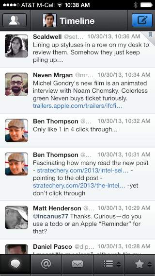
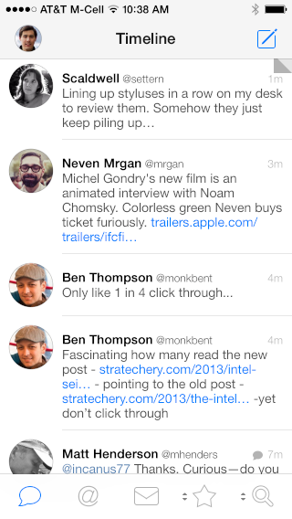
Second, it cannot fit as much on screen at once. Even with the smallest, non-bold font setting, there are fewer characters per line than I’d like. There is also additional vertical padding between tweets. It feels like my screen has shrunk.
Tweetbot 2

Tweetbot 3

Federico Viticci has a nice review:
While the core aspect of the tweet drawer has stayed the same, the fact that it now opens immediately after you tap is a huge improvement in my opinion. I haven’t missed the triple tap actions because the tweet drawer makes it easier to access a wider set of shortcuts; the new animation retains the old app’s idea of “pushing down” tweets below the drawer, but it also reinforces a new kind of physicality that feels less like a robot and more like an object you’re directly manipulating.
Update (2013-11-12): Tweetbot 3.1 adds a smaller font size, which is very nice. You can also turn off the round avatars and badges.
5 Comments RSS · Twitter
[...] 2 (App Store) is another iOS 7 update for a great app. I like the 5-day “week” view when you rotate the phone [...]
I agree about the spacing. I was excited at first, but I quickly got annoyed and switched back to Twitterrific.
[...] Link. Apple, the "small screen" phone maker, creates OS that wastes screen. Calendar.app is egregious. [...]
[…] like the new iOS version (App Store). It is frustrating, though, that this update again fits less on screen at once than the previous […]
[…] quality native Twitter client, but I see this update as a bit of a design regression. It continues the trend of lowering the information density by adding a row of buttons to each tweet. This consumes a […]