Safari 1.0 Beta 2
The change in Safari that I’m excited about is not the metal tabs but the font rendering. Previous versions of Safari always anti-aliased fonts and didn’t use screen fonts. The new version of Safari obeys the system anti-aliasing threshold, which I override for Safari like so:
defaults write com.apple.Safari AppleAntiAliasingThreshold 12
It also uses the real screen version of Geneva—sometimes.
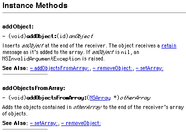
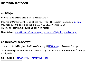
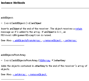
I previously showed examples of how Safari and iCab render one of Apple’s Web pages.
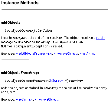
Below is Safari with the above anti-aliasing setting and the fonts set to Geneva 10 and Monaco 10.
Here’s what it looks like in iCab. The Safari text is now just as sharp as in iCab, and it seems to be using the proper letter shapes and spacing. Safari’s underlining still obscures the descenders, and it does poorly with the bold and italic text.
In all fairness, iCab’s italic Geneva 10 doesn’t look great either. For true bitmap nirvana, you have to reduce the font size to take advantage of the hand-tuned Geneva 9 bitmap.
Unfortunately, reducing the font size in Safari results in even worse bold and italic text.
By the way, Safari also renders the q tag now. See?
4 Comments RSS · Twitter
Excellent news on the q tag. I'll prolly check for myself later, but does it properly handle nested q tags?
Try bumping up the font size on a page with a <q> tag -- the quote characters don't increase in size. Odd.


