Fonts in iCab and Safari
Safari does a great job at rendering. It’s approximately as compatible with interactive sites as iCab. (Some work in one but not the other, and in both cases I occasionally have to use Internet Explorer.) I have some quibbles about the way it handles downloads and such, but it’s still beta and I think this stuff will all improve.
The area I’m concerned about is font rasterization. I don’t like fuzzy text, and Safari uses CoreGraphics, which is incapable of drawing nice crisp text. Some will say this is a feature, that the poor spacing is because it is more precisely following the font metrics. That’s taking WYSIWYG too far. The first job of a browsing application like Safari should be to make the content readable. If that means using a hand-tuned bitmap that is less true to the actual printed font, I’m all for it.
I am also well aware that many people like small anti-aliased text. Fine. I don’t want to take it away from you, and Apple wouldn’t listen to me anyway. However, I think Apple should let the user control the tradeoff between flavor and readability. This should be a system-level preference, and it should also be overridable at the application or font level.
Until Apple fixes this or the iCab folks improve their CSS support, I will be switching back and forth between iCab and Safari depending on the length and type of content, and on how much the page I’m reading uses CSS. (Developers: I would pay good money for a standards-compliant browser that uses QuickDraw.)
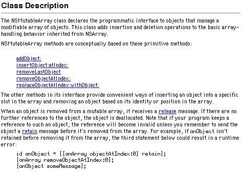
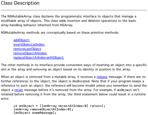
Here are some examples of how iCab and Safari render the documentation for NSMutableArray.
This is the class description in iCab. The body text is Geneva 10, the header is Helvetica, and the code is in ProFont. The text is crisp. It may not be beautiful, but I find it very easy to read. Note the way the descenders are drawn in the underlined text and how easy it is to see ProFont’s exaggerated punctuation.
This is the class description in Safari. The fonts are Geneva and ProFont. (Safari doesn’t provide an option for finer control, except through a custom stylesheet.) The bold text doesn’t appear bold because CoreGraphics doesn’t create synthetic styles. The descenders and the underlining are mashed together. The “anObject” in the code font stands out, jarringly so. The punctuation in the extended code example is muddy.
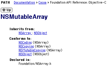
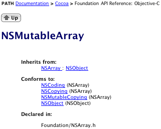
This is the top of the page in iCab. The header is anti-aliased with QuickDraw, and I think it looks nice. The indented headers appear very bold. My only complaint is that there’s a bit too much spacing after the opening parens.
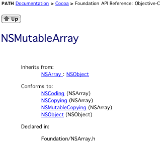
Here it is in Safari. Now it’s really obvious that Safari can’t do bold Geneva. The paren spacing is much better, though.
Here’s the same page using Safari’s default font, Lucida Grande. Now the bolds look nice. I’ll use Lucida Grande from now on, because it’s the font Apple uses to showcase CoreGraphics.
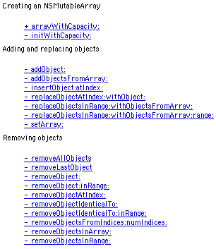
Here’s the method summary in iCab.
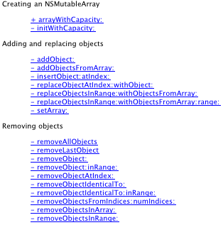
Here’s the method summary in Safari. Behold the smudges.
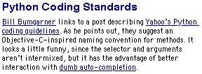
Now, here’s part of a post from my blog.
In Safari, you can’t even tell that the apostrophes are smart. The en-dash after the “C” looks shorter than the hyphen, and it’s really fuzzy. One thing I like about Safari’s rendering is that it doesn’t underline the space after “Python”; iCab does this, even though there’s a line break.
