iTunes 5
I like that the huge margins are gone, but the rest of the changes make it uglier without quite matching any of Apple’s other non-standard applications, either. It still uses modal dialogs and fudges the display of the keyboard shortcut for Play.
The first thing I tried to do was search my library for podcasts that matched a word, and it didn’t find any even though I have many matching tracks with that Genre.
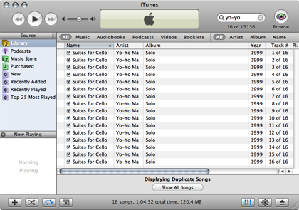
The second thing I tried was the new Show Duplicate Songs feature. But this doesn’t compare the file contents like iPhoto does; it just compares the metadata, finding tracks with the same name and artist (case insensitive) even if the content and duration differ. What’s the point of that? First of all, there are some songs that I have many different versions of—on purpose. Second, it’s worse than useless for some classical albums: Albinoni’s “The Complete Concertos, Opus 9” has six tracks called “Adagio” and six more called “Allegro.” I don’t think Yo-Yo Ma, who was in Apple’s audience yesterday, thinks that he played the same track 16 times in a row on his 1999 solo album. CDDB is weak for classical CDs, but still.
Here’s what other people are saying:
How much have they broken their HIG this time? I think square is the new black. For some reason, everything I see is square.
iTunes’ improved search functionality is nice, but a little inconsistent. Some fields, like Album, are always searched, but others, like Description, are only searched when they are displayed.
I think iTunes 5.0 is UGLY, especially the new glossy playback status bar & the volume slider.
Burnt Aqua isn’t ideal, but it’s hopefully some movement, and I’ll get similar pleasure if and when we see everything move to Aqua Unified. If everything starts getting those horrid Mail.application icons, I shall rail, but for just one day I’d like to see it as a hopeful sign of improvement instead of more weirdness, even though those in the other camp have just as high a chance of being right.
Now all Apple have to do is add this stuff to the HIToolbox and (on a more selfish note) AppKit, and fix Safari and iChat already.
But why, oh why- do we need yet another custom window on osx?
I was really hoping the unified/plastic look would replace brushed metal but it looks like we are just going to get a new smooth metal variant which I think is actually uglier *sigh*. Seriously someone needs to gift wrap the ugly stick and send it back to Redmond.
Me, I don’t have a lot of opinion yet (just observations).
The new paint job is nice (still visually distinctive in Exposé, though not as heavy as the metal), but I’m not impressed thus far. With regard to lyrics, the lesson is: if you are going to implement a feature, do it right or don’t do it at all.
I’m going to put off downloading iTunes 5 for as long as I can. It is butt-ugly. I don’t mind the smoothed over brushed metal look too much, though the gradients are a bit over-done. But everything is so horribly crowded now.
What’s up with the corner radii of these windows?
…in the previous version of iTunes there was consistency in these widgets. The widget layout was the same between the large iTunes window, and the smaller utility version. Now it’s inconsistent and widgets rearrange themselves depending on the window type.
The iPod nano looks to me like a home run. Take that for what you will, since I thought the original iPod would flop; and though, it was much better than the competition, I found the 3G frustratingly inelegant. But, if you like the other iPods or the iPod mini (and tens of millions presumably do), it seems to me that you’ll like the Nano even better. Personally, I’m happy with my Shuffle. It does exactly what I need and does it better than the Nano would.
September 8 Update
September 9 Update
- Rainer Brockerhoff
- Christopher Clark
- Denis Defreyne
- John Gruber
- Steve Harris
- Michael McCracken
- Sven-S. Porst
- Brent Simmons
- Chris Turner
10 Comments RSS · Twitter
Speaking of the "the new black" it seems that Apple has just that -- lots of high-gloss black. Observation from the apple website and the keynote presentation.
Notice the testing of new transitions in the Keynote presentation -- I'd like to see THAT in the keynote product. Looked SHARP!
iTunes 5 is horrible -- I like the new AppleScript functionality (broken down at Doug's AppleScripts)... now there's a slew of shapeshifter themes to change as it looks AWFUL until these themes are updated to support yet another custom window.
I sure hope this isn't a pre-cursor to a new theme in Leopard.
Although with all the negativity comes one positive thing. Metal sucks -- I de-metal anything and everything even if I am left with strange artifacts like Safari's tab bar backing.
You forgot the best feature, in my opinion: playlist folders. I have far too many playlists to reasonably fit without folders, so I've been waiting forever for this to be added.
Unfortunately, it makes me sad every time I switch back to iTunes and see the new interface.
Nitpick: Show Duplicate Songs has been there for several versions now and hasn't been improved in iTunes 5.0. The point of it is just pointing out the most notorious duplicates, since accurate detection is next to impossible - not to mention that you might *want* to keep some duplicates in order to have complete album listings.
Paul: I didn't forget them, I just didn't have anything to say about them. The playlist folders seem like a good idea, and they look and work as expected. As you can see, I don't use playlists. This is partially because I don't have much use for them (except temporary playlists, which can be handy), and partially because I don't want to waste time setting them up when I know that they'll be lost the next time iTunes loses track of the songs in my library (happens about once a year).
Jesper: Thanks for the correction. It looks like Show Duplicate Songs was added in 4.7.
I think your problem with searching by genre is that iTunes only searches displayed columns. Go to Edit > View Options, and make sure the Genre column is enabled.
Graham: I don't think that's it. You're right that it only searches displayed columns for the text that you type in, but I wasn't typing in "podcast"; I was using the "Podcasts" button on the new search bar to filter the search results further.
I much prefer the iTunes 5 HI, in fact I love it. Although... I don't go near PCs, so couldn't comment on the comparisons some have drawn with XP.
My earnest hope is that Apple does something similar with Finder windows to lose the (IMO) hideous screen estate-wasting metal frame.
All about jails, inmates, prisoners miami dade county jailmiami dade county jail